Tailwind Typography Test Pad
Typography Controls
Live Preview
Pro Tips
- Use larger line heights for better readability
- Maintain sufficient color contrast for accessibility
- Test your typography on different screen sizes
- Consider using system fonts for better performance
- Limit font variations to maintain consistency
Related Tailwind CSS Tools
Boost your Tailwind projects with these rad tools for alerts, typography, and more. Get set to make your site a total show-off!
Tailwind Alert Box Creator
Slap together snappy alert boxes with Tailwind CSS faster than you can say “look at me!”
Tailwind Class Sorter
Organize your Tailwind classes to keep your code as neat as a freshly folded laundry pile.
Tailwind Typography Test Pad – Finally, You Can See Your Fonts Before They Go Live
Ever slap on text-2xl leading-tight font-serif and wonder… “Is this too much?”
Or maybe try text-sm leading-loose and it suddenly looks like a Terms & Conditions paragraph from 2004?
Yup. We’ve been there.
The truth is — Tailwind gives you a ton of power when it comes to typography. But it also comes with one annoying problem:
You can’t always tell how it’ll look just from the class names.
That’s what this tool is for.
The Tailwind Typography Test Pad lets you write your own text, test out font sizes, line heights, and font families — and see the preview instantly. No setup. No config files. No flipping between tabs wondering why your h3 looks like an h1 in disguise.
Just type. Tweak. See it live.
Why We Built This (Because Typing Blind Is the Worst)
Let’s be honest: nobody remembers what leading-snug vs leading-normal vs leading-loose actually looks like without seeing it.
Even experienced devs are out here doing trial-and-error font sizing half the time. And beginners? Forget it — it’s a guessing game.
We built the Typography Test Pad so you can:
- Drop in your headline, paragraph, or block of content
- Try out different Tailwind typography utilities
- See how it feels before you commit to it in code
It’s not a fancy builder. It’s not a theme. It’s just a simple, focused playground to help you make type decisions faster (and smarter).
How It Works (Super Simple)
You’re basically two clicks away from clarity:
- Paste or type your text into the input box.
-
Pick your Tailwind classes from dropdowns:
- Font size (
text-sm,text-lg,text-5xl, etc.) - Line height (
leading-tight,leading-relaxed, etc.) - Font family (
font-sans,font-serif,font-mono)
- Font size (
- Your preview updates instantly, showing you how it looks.
- You also get a copy-paste-ready class string below the preview.
No build tools. No copy/pasting into your app and refreshing the page 10 times. It’s just... right there.
Examples You Can Try Right Now
Let’s say you’re working on a hero headline for your homepage.
Try this text:
“Welcome to the Future of Web Design”
Now preview it in different styles:
text-5xl leading-tight font-sans– Looks modern and sharp.text-4xl leading-loose font-serif– More traditional and elegant.text-3xl leading-normal font-mono– Kinda techy, feels code-y.
Or maybe you're writing a paragraph:
“Tailwind lets you rapidly build modern websites without ever leaving your HTML.”
Try it with:
text-base leading-relaxed font-sans– Perfect for blog content.text-sm leading-tight font-mono– More compact, like documentation.text-lg leading-loose font-serif– More comfortable and old-school.
The cool thing? You can compare all of this instantly.
Who This Tool Helps
Anyone using Tailwind, really. But especially:
- Frontend developers who want to quickly check typography flow without firing up a full local build.
- Designers who care how type feels before shipping a layout.
- Content creators who want readable blog styles.
- Students learning the difference between
text-xlandtext-2xl(spoiler: it's more than you think). - Agencies working on multiple themes who need consistency in heading and body text.
Even if you’re just playing around with Tailwind for the first time, this is a no-stress way to learn how type works visually.
Why Typography Isn’t One-Size-Fits-All
You already know this — but it’s worth repeating:
Typography changes everything.
- The same words can feel elegant or rushed depending on line height.
- Font families can shift a message from casual to corporate.
- A slightly larger
text-lgcan make mobile content feel way more readable.
And yet... most people treat type like an afterthought.
This tool lets you explore the nuance of typography without needing to write a bunch of code or stare at Tailwind docs.
You get to feel it. And that’s where the magic is.
Quick-Reference Class Guide (Because You're Probably Wondering)
Font Sizes
| Class | Size (approx) | Usage |
|---|---|---|
text-sm |
~0.875rem | Small notes, legal text |
text-base |
1rem | Body content |
text-lg |
~1.125rem | Articles, blog copy |
text-xl |
~1.25rem | Subheadings |
text-3xl |
~1.875rem | Section titles |
text-6xl |
~3.75rem | Hero headlines |
Line Heights
| Class | Spacing Style |
|---|---|
leading-none |
No space between lines |
leading-tight |
Compact line spacing |
leading-normal |
Default setting |
leading-relaxed |
Slightly more airy |
leading-loose |
Very open, calm reading feel |
Font Families
| Class | Vibe |
|---|---|
font-sans |
Clean, modern |
font-serif |
Elegant, traditional |
font-mono |
Techy, coding feel |
FAQ – In Case You're Wondering
Q: Does this support dark mode previews?
Not yet, but we’re considering it. Right now it defaults to a light background.
Q: Can I copy the class string directly?
Absolutely. Once you’ve set your options, the combined Tailwind class string appears — just copy and paste into your HTML.
Q: Can I test responsive variants (like md:text-xl)?
This version is focused on base styles. Responsive class preview might be added later.
Q: What if I want to test custom fonts?
Right now, it sticks with Tailwind’s default font families. Custom font support would need font loading, so that’s a future feature maybe.
Q: Do I have to sign in to use it?
Nope. Totally free. No sign-up, no email traps, nothing.
What Folks Might Say
“Literally used this to fix all the janky spacing on my landing page. Took me 5 minutes.”
– Ali, solo founder
“Didn’t realize
leading-loosemade such a big difference until I saw it here.”
– Saba, UI designer
“Just fun to mess around with. Like a type sandbox.”
– Hamza, frontend dev
You don’t have to be a typography nerd to enjoy this — but you might become one after playing with it for a bit.
Wrapping Up (Last Thing, Promise)
Fonts matter.
Spacing matters.
But guessing your way through typography classes? That’s a headache.
The Tailwind Typography Test Pad gives you a way to:
- Try font classes without writing code
- Preview spacing and feel instantly
- Copy classes you actually want to use
And that means fewer bad font choices, fewer broken headlines, and fewer “ugh, why does this look weird?” moments.
So yeah — go ahead. Paste in your next heading, tweak the settings, and actually see what your words are going to look like.
Latest Insights and Resources
The Ultimate Guide to Building Your WordPress Site from Scratch
Starting a website might seem overwhelming at first, but with WordPress, it’s more accessible than you think. Whether you’re creating […]
Exploring Behestmtl.wordpress.com: A Look at WordPress & Twitter Integration
Welcome to our deep dive into behestmtl.wordpress.com, a vibrant platform that combines the power of WordPress with seamless Twitter integration. […]
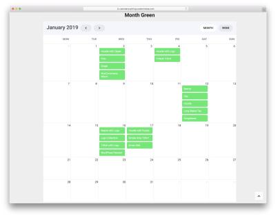
How to Embed a Calendar into WordPress for Better Scheduling
Are you looking to make your website more organized and user-friendly? Embedding a calendar into your WordPress site is a […]