Mobile View Cropper
📋 Original Screenshot
Related Design & Testing Tools
Test and fine-tune your designs with these sweet tools for spacing, colors, and performance. Your site’s about to be the talk of the town!
Button Spacing Comparator
Fine-tune button spacing like you’re tuning a guitar for a perfect chord.
Pixel Gap Tester
Measure pixel gaps to keep your layouts as tight as a new skateboard.
Dark Mode Checker
Test your site’s dark mode to keep it chill like a moonlit night.
Line Height Tester
Tweak line heights to make your text flow like a lazy river.
Color Vibe Detector
Pick colors that vibe like a perfect playlist for your site.
Image File Type Identifier
Sort out image file types to keep your site running smoother than butter.
Page Load Time Estimator
Check page load times to make your site zippy as a roadrunner.
Preloader Timer Simulator
Test preloaders to keep users hooked like a cliffhanger movie.
Text-to-ALT Description Generator
Create ALT text for images to make your site friendly as a neighbor’s BBQ.
Fluffy Word Counter
Cut the fluff from your content to keep it sharp like a chef’s knife.
Font Awesome to Unicode Converter
Swap Font Awesome icons to Unicode quicker than a snap of your fingers.
Mobile View Cropper – Your Desktop Screenshot is Lying to You
Ever taken a gorgeous screenshot of your website on your 27-inch monitor, then wondered what the hell it actually looks like on someone's phone?
You squint at Chrome DevTools. Maybe grab your phone and try to line it up. Or worse, you just assume it "probably looks fine" on mobile.
Meanwhile, your beautiful desktop layout might be completely broken on mobile. Your sidebar? Gone. Your carefully crafted hero section? Cut in half. Your navigation? Hamburger menu'd into oblivion.
That's why we built the Mobile View Cropper.
Upload your desktop screenshot. Pick a phone size. Get back exactly what mobile users actually see. No guesswork, no assumptions, just reality.
Because honestly? Most of us have no clue what our sites look like on phones until it's too late.
How This Thing Works
Pretty straightforward:
-
Upload your desktop screenshot (PNG, JPG, whatever)
-
Pick your poison:
-
iPhone SE (375px) — the tiny one that breaks everything
-
iPhone 12 (390px) — what most people actually use
-
iPhone Pro Max (414px) — the boat phone
-
Plus some Android sizes thrown in
-
-
Hit the button
-
Download your cropped mobile view
The tool crops from the left edge (like real browsers do) and shows you exactly what fits in that viewport. Sometimes it's shocking. Usually it's humbling.
Why Your Desktop Screenshot is Useless
Look, desktop screenshots are great for showing off. But they're terrible for understanding user experience.
Your 1920px desktop view shows everything — header, sidebar, main content, footer, ads, social widgets, the works. But mobile? Mobile shows maybe 20% of that.
And if you're designing on a big monitor (which you probably are), you literally cannot visualize what mobile users see. Your brain doesn't work that way.
Real Examples That'll Make You Wince
E-commerce homepage:
Desktop shows product grid, filters, recommendations, reviews.
iPhone SE shows... the logo and maybe one product thumbnail.
Blog post:
Desktop shows article, sidebar, related posts, comments.
iPhone 12 shows the headline and two paragraphs. Maybe.
Landing page:
Desktop shows hero, features, testimonials, pricing, FAQ.
iPhone Pro Max shows the hero image and half a headline.
Starting to see the problem? Your desktop screenshot is showing a completely different website than what mobile users experience.
Who Actually Uses This
Anyone who's ever said "but it looks fine on my laptop" and then discovered their mobile conversion rate sucks.
-
Freelancers who need to show clients the mobile reality without the awkward phone-squinting dance
-
Agencies documenting responsive design failures (or successes)
-
Marketers who finally want to see what their landing pages actually look like on phones
-
Business owners who keep hearing "mobile-first" but have no idea what that means
-
Developers who are tired of explaining why the sidebar disappeared
The Brutal Truth About Mobile Viewports
Here's what nobody tells you about mobile screen sizes:
| Device | Screen Width | Reality Check |
|---|---|---|
| iPhone SE | 375px | Still popular, breaks most designs |
| iPhone 12 | 390px | Most common size, your baseline |
| iPhone Pro Max | 414px | Biggest iPhone, still tiny vs desktop |
| Your laptop | 1920px+ | 5x wider than most phones |
Yeah, that's right. Your laptop screen is literally 5 times wider than most phones. And you're designing for both. Good luck with that.
What Gets Cut Off (Spoiler: Everything)
Different site types, same mobile reality:
| Site Type | What You Think Shows | What Actually Shows |
|---|---|---|
| Corporate | Navigation + hero + services | Logo + hamburger menu |
| Blog | Post + sidebar + ads | Title + first paragraph |
| Shop | Products + filters + cart | One product image (maybe) |
| Portfolio | Gallery + bio + contact | One project thumbnail |
Notice a pattern? Mobile users see almost nothing compared to your desktop masterpiece.
Common Questions
Q: Is this actually how my site looks on mobile?
It's how much of your desktop screenshot would fit in a mobile viewport. Your actual mobile site might be responsive and look different.
Q: Can I crop multiple screenshots?
One at a time right now. Takes about 10 seconds per image though.
Q: What about tablets?
We focus on phones because that's where most mobile traffic comes from. Tablets are somewhere in between.
Q: Does it cost anything?
Nope. Free tool, no signup, no limits.
What People Actually Say
"Holy shit, I had no idea my homepage looked that bad on mobile."
– Sarah, small business owner
"Finally, a way to show clients what mobile users actually see without pulling out my phone."
– Mike, freelance designer
"This explained why our mobile conversion rate was garbage."
– Jessica, e-commerce manager
These are real reactions from real people who finally saw their mobile reality.
The Bottom Line
Mobile traffic is probably 60%+ of your visitors. But you're designing and reviewing on desktop. That's like writing a book while looking through a telescope.
Your desktop screenshot shows everything. Your mobile users see almost nothing. And until you actually see that crop, you're flying blind.
This tool just shows you the truth:
"Here's what your website actually looks like on the devices people actually use."
It's not always pretty. But it's always eye-opening.
Upload a screenshot. Pick a phone size. See the mobile reality.
Latest Insights and Resources

The Ultimate Guide to Building Your WordPress Site from Scratch
Starting a website might seem overwhelming at first, but with WordPress, it’s more accessible than you think. Whether you’re creating […]
Exploring Behestmtl.wordpress.com: A Look at WordPress & Twitter Integration
Welcome to our deep dive into behestmtl.wordpress.com, a vibrant platform that combines the power of WordPress with seamless Twitter integration. […]
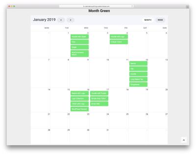
How to Embed a Calendar into WordPress for Better Scheduling
Are you looking to make your website more organized and user-friendly? Embedding a calendar into your WordPress site is a […]