Layout Width Calculator
Width Breakdown
Visual Representation
Generated CSS
/* Enter values to generate CSS */
Related HTML & Layout Tools
Simplify your HTML and layout tasks with these nifty tools for cleaner, sharper code. Your site’s about to be the talk of the town!
HTML Tag Counter
Count your HTML tags faster than you can say “code ninja,” so you know exactly what’s cooking in your markup.
HTML Tag Cleaner
Clear out junky tags to keep your code as pristine as a freshly mowed lawn.
HTML Div Layer Counter
Track your div layers to keep your layout tighter than a new guitar string.
H1 Duplication Checker
Spot duplicate H1 tags to give your SEO a fist bump and make search engines smile.
Hey, you ever been deep in a web design project, trying to make everything line up just right, only to realize your div is way wider than you thought? Ugh, I’ve been there, and it’s the WORST. You set your content width, add some padding and borders, and suddenly your layout’s all out of whack. That’s why I made this super handy tool called the Layout Width Calculator. You can check it out at themespanda.com/layout-width-calculator/. It’s like a magic wand that figures out the exact width of your element in pixels, so you don’t have to do the math yourself. Whether you’re a pro designer, a coder grinding away, or just someone messing around with CSS for fun, this tool’s gonna save you some serious headaches.
I’m not kidding when I say this thing’s a lifesaver. I built it because I was sick of screwing up my layouts and spending hours fixing pixel-perfect mistakes. It’s simple, it’s free, and it’s got a clean vibe that makes it easy to use. Ever had one of those moments where you’re like, “Why is this div so big?!” This calculator’s here to answer that question in, like, two seconds flat. So, let’s dive into what it does and why you’re gonna love it.
What’s This Calculator All About?
Okay, picture this: you’re designing a webpage, and you’ve got a div with a content width of, say, 300px. But you’ve also got padding and borders, and those add up in ways that can mess with your head. The Layout Width Calculator takes all that confusion and tosses it out the window. You just plug in your content width, your padding (left and right), and your border sizes (also left and right), and it tells you the TOTAL width of your element in pixels. No more guessing or scribbling math on a Post-it note.
It’s built around the CSS box model, which is how browsers figure out how big stuff is. If you’ve ever worked with CSS, you know the box model can be a bit of a jerk sometimes. The content width is only part of the story—padding and borders get added on, and if you forget to account for them, your layout’s gonna look like a yard sale. This tool does the math for you, so you can focus on making your site look awesome. Ever gotten stuck because your elements weren’t lining up right? Yeah, this fixes that.
How It Actually Works
So, how’s this thing do its thing? It’s super straightforward. You head over to the website, and you’ll see a few boxes where you enter your numbers. You need:
- Content Width: How wide your actual content is, in pixels.
- Padding: The space on the left and right sides between the content and the border.
- Border: How thick the border is on each side, also in pixels.
Once you’ve got your numbers, you hit the “Calculate” button, and bam—it spits out the total width. The math is based on this formula:
Total Width = Content Width + (Left Padding + Right Padding) + (Left Border + Right Border)
For example, let’s say your div has a content width of 200px, 10px padding on each side, and a 2px border on each side. You type those in, and the calculator tells you the total width is 224px. That’s 200 (content) + 10 (left padding) + 10 (right padding) + 2 (left border) + 2 (right border). It’s that easy. I made sure the tool works on your phone or laptop, so you can use it anywhere. Ever tried doing this math in your head and gotten it wrong? I have, and it’s not fun.
Why You’re Gonna Be Obsessed with It
Alright, let’s talk about why this tool is so awesome. First off, it saves you time. Like, a LOT of time. If you’ve ever spent 20 minutes tweaking CSS because your layout was off by a few pixels, you know what I’m talking about. This calculator gives you the answer instantly, so you can move on with your life. It’s also perfect for beginners who are still figuring out the CSS box model. When I was learning, I was so confused about why my stuff wasn’t lining up. This tool would’ve been a total game-changer.
Plus, it’s versatile. Whether you’re working on a simple blog or a fancy grid layout, this calculator’s got your back. And get this—it’s totally free. No sign-ups, no subscriptions, no nonsense. Just go to the site and start using it. I wanted to make something that anyone could use, whether you’re a student, a hobbyist, or a pro. Here’s who I think will love it:
- Web Designers: Get your layouts pixel-perfect without sweating it.
- Developers: Check your CSS math in a snap.
- Students: Learn the box model without feeling overwhelmed.
- Hobbyists: Play around with layouts and see how changes affect the size.
Got a project where you need to know exact sizes? This tool’s your new best friend.
Real-World Examples
Let’s talk about how this tool shines in real life. Say you’re building a card component for a portfolio site. You want the content to be 300px wide, with 15px padding on each side and a 3px border. You plug those into the calculator:
- Content Width: 300px
- Left Padding: 15px
- Right Padding: 15px
- Left Border: 3px
- Right Border: 3px
Hit calculate, and you get 336px. Now you know your card takes up exactly 336px, so you can plan your layout without any surprises. Or maybe you’re making a nav bar, and each button has 20px padding and a 1px border, with a content width of 100px. The calculator says each button is 142px wide, so you can space them out perfectly.
Here’s a table to show how it works with different inputs:
| Content Width (px) | Left Padding (px) | Right Padding (px) | Left Border (px) | Right Border (px) | Total Width (px) |
|---|---|---|---|---|---|
| 200 | 10 | 10 | 2 | 2 | 224 |
| 300 | 15 | 15 | 3 | 3 | 336 |
| 100 | 20 | 20 | 1 | 1 | 142 |
Pretty cool, right? It’s like having a cheat code for your layouts.
Tips to Use It Like a Pro
Wanna get the most out of this tool? Here’s what I’ve learned:
- Double-Check Your Numbers: Make sure your left and right padding or borders are correct, especially if they’re different.
- Plan First: Use the calculator before you code to map out your sizes.
- Pair It Up: Use it with other tools like a grid calculator or design software for max precision.
- Bookmark It: Trust me, you’ll wanna come back to it.
It’s like having a tape measure for your website. No more guessing if your elements will fit.
Why I Built This Thing
Real talk: I made this tool because I was fed up. A while back, I was working on a freelance gig, and my layouts kept breaking because I wasn’t calculating widths right. I’d set a width, add padding, and then wonder why everything was off by a few pixels. It was driving me nuts! So, I decided to build something to handle the math for me. I wanted it to be dead simple, free, and useful for anyone who’s ever struggled with CSS layouts.
I’ve had friends try it out, and they’re like, “Dude, this is so much better than guessing!” One of them used it to plan out an entire website, and it saved them hours of tweaking. That’s the kind of stuff that makes me happy. Ever made something to solve a problem you were facing? It’s the best feeling when it actually helps.
What’s Next?
I’m not done with this tool yet. I’m thinking about adding features like calculating heights or maybe even margins. Or how about a way to save your calculations for later? If you’ve got ideas for what would make it better, hit me up! What’s one feature you’d love to see in a tool like this?
For now, go check it out at themespanda.com/layout-width-calculator/. It’s free, it’s fast, and it’s here to make your web design life a little easier. Whether you’re building a blog, a portfolio, or something crazy complicated, this calculator’s got your back. Give it a spin and let me know how it goes. Happy designing!
Latest Insights and Resources
The Ultimate Guide to Building Your WordPress Site from Scratch
Starting a website might seem overwhelming at first, but with WordPress, it’s more accessible than you think. Whether you’re creating […]
Exploring Behestmtl.wordpress.com: A Look at WordPress & Twitter Integration
Welcome to our deep dive into behestmtl.wordpress.com, a vibrant platform that combines the power of WordPress with seamless Twitter integration. […]
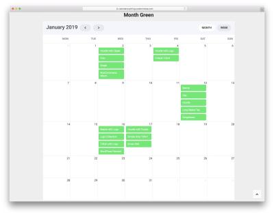
How to Embed a Calendar into WordPress for Better Scheduling
Are you looking to make your website more organized and user-friendly? Embedding a calendar into your WordPress site is a […]