Button Spacing Comparator
Button Comparison Results
Generated Code
<button class="px-4 py-2 bg-green-500 text-white rounded hover:bg-green-600">
Sample Button
</button>
<!-- Button B -->
<button class="px-6 py-3 bg-green-500 text-white rounded hover:bg-green-600">
Sample Button
</button>
Related Design & Testing Tools
Test and fine-tune your designs with these sweet tools for spacing, colors, and performance. Your site’s about to be the talk of the town!
Pixel Gap Tester
Measure pixel gaps to keep your layouts as tight as a new skateboard.
Mobile View Cropper
Crop and test designs so your site looks dope on phones, no squinting required.
Dark Mode Checker
Test your site’s dark mode to keep it chill like a moonlit night.
Line Height Tester
Tweak line heights to make your text flow like a lazy river.
Color Vibe Detector
Pick colors that vibe like a perfect playlist for your site.
Image File Type Identifier
Sort out image file types to keep your site running smoother than butter.
Page Load Time Estimator
Check page load times to make your site zippy as a roadrunner.
Preloader Timer Simulator
Test preloaders to keep users hooked like a cliffhanger movie.
Text-to-ALT Description Generator
Create ALT text for images to make your site friendly as a neighbor’s BBQ.
Fluffy Word Counter
Cut the fluff from your content to keep it sharp like a chef’s knife.
Font Awesome to Unicode Converter
Swap Font Awesome icons to Unicode quicker than a snap of your fingers.
Button Spacing Comparator – Quit Fumbling with Button Padding
Okay, real talk: have you ever spent, like, 20 minutes tweaking a button’s padding in CSS, hitting refresh, and still ending up with something that looks like it was styled by a raccoon? You’re messing with padding-left, padding-top, whatever, and it’s either too squished or so fat it’s taking over the page.
I’ve been there, ready to yeet my laptop. That’s why the Button Spacing Comparator is my new obsession. You pick padding values for two buttons, see them side-by-side like they’re duking it out, and get Tailwind classes to make it real. No more guessing if your button looks clickable or just sad.
It’s like picking between two burgers—one’s perfect, one’s a mess. You see it, you choose, you move on.
⚙️ How This Thing Actually Works
It’s so stupidly simple, it’s almost rude:
-
Pick
px(horizontal) andpy(vertical) values for two buttons. -
Slide some bars or type numbers to dial it in.
-
Check out the two buttons rendered next to each other, like a beauty pageant for CSS.
-
Snag the Tailwind classes—like
px-3 py-2—and paste them into your code.
No more bouncing between your editor and browser like a ping-pong ball. Just instant button clarity.
Why This Tool’s a Freaking Lifesaver
Button padding isn’t just about looks—it’s about making something people can actually click without rage-quitting. Too tight, and your text looks like it’s choking. Too much, and your button’s hogging space like it owns the place. And if you’re designing for mobile? Good luck without a nervous breakdown.
This tool makes comparing button padding simple—and kind of fun. Just pick two padding styles, see which one looks better, and get the ready-made Tailwind classes. No more typing out padding: 8px 16px like it’s 2015.
It’s the fast way to design buttons that actually feel good to use.
🔧 What You Get
This tool gives you two test buttons with Tailwind padding classes:
Button 1: Slim Jimclass="px-2 py-1"
✅ Neat and compact—ideal for tighter layouts.
Button 2: Big Boiclass="px-8 py-4"
✅ Roomy and finger-friendly—perfect for mobile screens.
Side-by-Side Showdown
✅ Two buttons staring each other down, so you can pick the winner.
Trash Combo?
❌ If one button looks like it’s wearing flip-flops to a wedding, you’ll know before you copy the code.
It’s like a vibe check for your buttons, no therapy required.
Who’s Gonna Worship This
Anyone who’s ever touched a button’s CSS and regretted it:
-
Coders who want buttons that don’t look like a design crime.
-
Designers throwing together UIs without a CSS meltdown.
-
Freelancers hustling to make clients happy before the clock runs out.
-
Newbies figuring out why padding makes or breaks a button.
-
Students trying to make their projects look less like 1999 Geocities.
-
Even Tailwind wizards who don’t wanna guess
px-5vs.px-6.
Why Button Padding’s a Sneaky Beast
Padding’s not just decoration—it’s the difference between “clickable” and “why is this so ugly?” Here’s the tea:
| Padding Type | Example Class | Why It’s a Hassle |
|---|---|---|
| Horizontal (px) | px-4 |
Too little, and your text’s squashed; too much, and the button’s a diva. |
| Vertical (py) | py-2 |
Skimp here, and it’s unclickable; overdo it, and it’s a chonky mess. |
| Both Together | px-4 py-2 |
Balancing them is like mixing a cocktail—easy to botch. |
Tweaking padding in your editor is like playing Whac-A-Mole. This tool lets you compare two buttons head-to-head, so you can ditch the guesswork and move on with your life.
Sample Button Face-Offs
Here’s what you might see:
| Button Vibe | Tailwind Class |
|---|---|
| Skinny Mini | px-1 py-1 |
| Thicc King | px-6 py-3 |
| Just Right | px-4 py-2 |
| Hot Mess Combo | ❌ Preview’s like, “Bruh, no,” before you copy garbage. |
That side-by-side preview is your wingman—it stops you from shipping a button that looks like it was styled in the dark.
Stuff You’re Probably Wondering
Q: Can I go wild with padding?
Heck yeah! Crank those sliders and see what weirdness you can create.
Q: Only for Tailwind folks?
Output’s Tailwind classes, but you can eyeball the preview for any project and convert to raw CSS if you’re a purist.
Q: What if I pick dumb values?
The preview’s gonna roast you (nicely) so you can tweak before you tank your design.
Q: Free, right?
100%. No login, no ads, just a tool that does its job.
Q: Can I save my button battles?
Not yet, but copying the classes is faster than scrolling through X.
What People Might Yell
“I was about to lose it over button padding. This tool had me sorted in seconds.”
– Hadi, coder
“Seeing two buttons side-by-side is like picking the better taco. So clutch.”
– Rania, designer
“No more guessing Tailwind padding classes at 3 a.m. This is my jam.”
– Omar, freelancer
No review page yet, but I bet users would hype this up after dodging the padding struggle.
Wrapping It Up
Button padding’s the secret sauce for clean, clickable designs, but tweaking it by hand is like trying to parallel park in a storm. One wrong move, and your button’s either too tight or obnoxiously huge.
The Button Spacing Comparator’s here to save your butt. It answers one question:
“Which padding makes my button look like it’s got its life together?”
Pick your values, compare two buttons, grab the Tailwind classes. It’s so easy, you’ll wonder why you ever suffered through padding tweaks the old way.
Next time your buttons look like a hot mess, hit this tool. You’ll be back to binge-watching in no time.
Latest Insights and Resources
The Ultimate Guide to Building Your WordPress Site from Scratch
Starting a website might seem overwhelming at first, but with WordPress, it’s more accessible than you think. Whether you’re creating […]
Exploring Behestmtl.wordpress.com: A Look at WordPress & Twitter Integration
Welcome to our deep dive into behestmtl.wordpress.com, a vibrant platform that combines the power of WordPress with seamless Twitter integration. […]
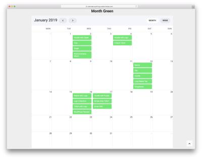
How to Embed a Calendar into WordPress for Better Scheduling
Are you looking to make your website more organized and user-friendly? Embedding a calendar into your WordPress site is a […]