CSS Clip-Path Generator
🔧 Shape Selection
⚡ Quick Presets
👁️ Live Preview
📤 Export Options
Related CSS & Animation Tools
Crank up your designs with these rad CSS and animation tools. They’re perfect for crafting visuals that’ll have everyone double-tapping their screens!
CSS Animation Time Visualizer
Fine-tune your animations to flow like a perfect playlist—no skips, just smooth vibes.
CSS Z-Index Visualizer
Stack your elements like a pro with this tool. No more “why is this thing hiding?” headaches.
CSS Class Unroller
Untangle messy CSS classes so your code reads like a breezy novel, not a puzzle.
Emoji-to-CSS Class Mapper
Turn emojis into CSS classes for some seriously fun styling. Because who doesn’t want a 😺 on their site?
CSS Icon Pack Name Checker
Make sure your icon packs play nice with your project. It’s like a VIP list for your icons.
CSS Clip-Path Generator – Shapes That Don’t Make You Wanna Scream
So, you’re trying to make a cool circular image or a snazzy triangle in CSS, and you dive into clip-path. Five minutes later, you’re staring at a shape that looks like it was drawn by a drunk robot. You tweak some numbers, hit refresh, and… nope, still garbage. Sound like your last coding session?
That’s where the CSS Clip-Path Generator swoops in like a superhero. Pick a shape, slide some bars, see it live, and grab the CSS code that actually works. No more feeling like you’re solving a Rubik’s Cube blindfolded.
It’s you versus clip-path, and this tool’s got your back.
⚙️ How This Thing Saves Your Sanity
It’s stupidly easy to use:
-
Click a shape—circle, triangle, or polygon. No PhD needed.
-
Mess with sliders or type in sizes till it looks right.
-
Check the live preview to make sure it’s not a total disaster.
-
Copy the clip-path code and paste it into your project like a boss.
No Googling tutorials. No swearing at percentages. Just shapes that don’t suck.
Why You Need This in Your Life
CSS clip-path is like that friend who’s super talented but impossible to deal with. It can make your designs look fire—think circular avatars or pointy buttons—but the code? It’s like writing a love letter in binary. One wrong number, and your triangle looks like a sad kite.
This generator’s like, “Hold my coffee.” You pick your shape, tweak it, see it in action, and get code you can actually use. Deadlines? Client mockups? No problem. You’re done in 30 seconds.
🔧 What You Can Whip Up
Here’s the kind of magic you’re getting:
Circle clip-path: circle(40% at 50% 50%); ✅ Round like a donut, with sliders to make it big or small.
Triangle clip-path: polygon(50% 0, 0 100%, 100% 100%); ✅ Sharp and pointy, tweak it for any angle you’re vibing with.
Polygon (Hexagon) clip-path: polygon(25% 0, 75% 0, 100% 50%, 75% 100%, 25% 100%, 0 50%); ✅ Funky multi-sided shapes, no need to play math nerd.
Messed-Up Input? ❌ The preview’s like, “Yo, fix this,” so you don’t copy code that’ll embarrass you.
It’s like having a CSS wizard in your browser, minus the pointy hat.
Who’s This For?
Anyone who’s ever touched CSS and lived to regret it:
-
Devs who want cool shapes without losing their minds.
-
Designers who need to fake CSS skills for a mockup.
-
Freelancers racing the clock to impress clients.
-
Beginners who just want shapes without a CSS crash course.
-
Students trying to make their projects look less basic.
-
Even CSS gods who are over typing clip-path from scratch.
Why Clip-Path Is a Total Gremlin
Every shape’s got its own brand of chaos:
| Shape | Code Example | Why It’s Annoying |
|---|---|---|
| Circle | circle(50% at 50% 50%) | Screw up the radius or center, and it’s a lumpy mess. |
| Triangle | polygon(50% 0, 0 100%, 100% 100%) | One bad point, and it’s not even a shape anymore. |
| Polygon | polygon(25% 0, 75% 0, 100% 50%, ...) | Plotting points by hand is like drawing a star in MS Paint. |
Trying to figure this out in your editor is like herding cats. This tool hands you the code and a preview, so you can skip the meltdown.
Shapes You’ll Actually Get
Here’s what you’re working with:
| Shape | Code You Snag |
|---|---|
| Mini Circle | clip-path: circle(30% at 50% 50%) |
| Pointy Triangle | clip-path: polygon(50% 0, 0 100%, 100% 100%) |
| Pentagon Party | clip-path: polygon(50% 0, 100% 38%, 82% 100%, 18% 100%, 0 38%) |
| Oopsie Input | ❌ Preview’s like, “Nah, try again,” before you copy junk. |
That live preview is your BFF—it stops you from pasting code that’ll make your coworkers cringe.
Stuff You’re Probably Wondering
Q: Can I make wacky shapes? Heck yeah! Go nuts with polygons and tweak the points.
Q: Works in all browsers? Yup, it’s standard clip-path. Runs smooth in Chrome, Firefox, all the big dogs. Preview’s got your back.
Q: What if I botch the settings? Preview’s gonna roast you (nicely) so you can fix it before it’s a problem.
Q: Free, right? Totally. No sign-up, no spam, just a tool that does its thing.
Q: Can I save my shapes? Not yet, but copying the code’s faster than texting your mom back.
What People Might Yell About It
“I was this close to yeeting my laptop over a triangle. This tool saved me.” – Ammar, dev
“Live preview’s like, ‘Here’s your shape, dummy.’ Love it.” – Layla, designer
“No more Googling clip-path at 2 a.m. This is my new jam.” – Zain, freelancer
We don’t have reviews up yet, but I’m betting users would lose it (in a good way) after dodging the clip-path struggle.
Let’s Be Real
CSS clip-path is a total rockstar for making your designs pop, but the code’s like deciphering ancient runes. One typo, and your polygon looks like a crime scene.
The CSS Clip-Path Generator’s here to keep you sane. It answers one question:
“How do I make this shape without losing my will to live?”
Pick a shape, play with it, check the preview, and copy the code. It’s so easy, you’ll wonder why you ever suffered through clip-path the old way.
Next time CSS tries to ruin your day, hit this tool up. You’ll be high-fiving your screen in no time.
Latest Insights and Resources
The Ultimate Guide to Building Your WordPress Site from Scratch
Starting a website might seem overwhelming at first, but with WordPress, it’s more accessible than you think. Whether you’re creating […]
Exploring Behestmtl.wordpress.com: A Look at WordPress & Twitter Integration
Welcome to our deep dive into behestmtl.wordpress.com, a vibrant platform that combines the power of WordPress with seamless Twitter integration. […]
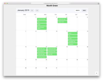
How to Embed a Calendar into WordPress for Better Scheduling
Are you looking to make your website more organized and user-friendly? Embedding a calendar into your WordPress site is a […]