Hey there! If you’re running a WordPress site, you may have noticed that images don’t always look great on every device. Desktop screens are big and spacious, while smartphones demand smaller, optimized visuals. Using the same image across all devices can slow down your site and make it less user-friendly. Don’t worry—there’s an easy way to display different images on desktop and mobile! In this guide, we’ll walk through why responsive images matter and how you can set them up seamlessly in WordPress. Let’s make your site look fantastic on any device!
Understanding the Need for Responsive Images in WordPress
In today’s digital world, users access websites from a variety of devices—desktops, tablets, smartphones, and even smart TVs. This diversity means your website’s images need to adapt to different screen sizes and resolutions to provide an optimal experience. Responsive images are designed to do just that: they automatically adjust their size and quality based on the device viewing them.
Why is this so important? Here are some key reasons:
- Improved User Experience: Visitors don’t want to pinch and zoom or wait forever for images to load. Responsive images ensure your content looks sharp and loads quickly, regardless of device.
- Faster Loading Times: Smaller, optimized images on mobile reduce page load times, which is crucial for keeping visitors engaged and improving SEO rankings.
- Better SEO: Search engines favor mobile-friendly, fast-loading sites. Properly implemented responsive images can boost your rankings.
- Bandwidth Savings: Mobile users often have limited data plans. Serving appropriately sized images helps save their bandwidth and keeps them happy.
Traditionally, web developers used techniques like media queries and multiple image versions to handle different devices. But managing this manually can be cumbersome, especially for non-developers. Thankfully, WordPress offers tools and plugins that make this process much easier, allowing you to display different images depending on the device. Understanding why responsive images matter is the first step toward a faster, more user-friendly website. In the next sections, we’ll explore practical methods to implement this without breaking a sweat.
3. Methods to Show Different Images on Desktop and Mobile
When it comes to optimizing your website for all devices, showing different images on desktop and mobile is a fantastic way to enhance user experience and improve load times. There are several ways to do this, ranging from manual coding to using built-in WordPress features. Let’s explore some of the most effective methods.
Using CSS Media Queries
One classic approach involves CSS media queries. With this method, you can load different images based on the screen size without needing any plugins or complex setups. Here’s how it works:
- Insert multiple images into your post or page, each with a unique class or ID.
- Use CSS media queries to control which image is visible depending on the device width.
For example:
<style> / Show desktop image on larger screens / .desktop-image { display: block; } .mobile-image { display: none; } / On screens smaller than 768px, switch images / @media (max-width: 768px) { .desktop-image { display: none; } .mobile-image { display: block; } }</style><img src="desktop-image.jpg" class="desktop-image" alt="Desktop View"><img src="mobile-image.jpg" class="mobile-image" alt="Mobile View">
This approach is straightforward and works well if you’re comfortable editing HTML and CSS. Just keep in mind that both images will load, which might impact page speed, especially if they are large.
Using Conditional PHP in Your Theme
If you’re comfortable with editing your theme files, you can use PHP conditional tags to load images based on device type. For example, with the wp_is_mobile() function, you can display different images:
<?phpif ( wp_is_mobile() ) { echo '<img src="mobile-image.jpg" alt="Mobile Image">';} else { echo '<img src="desktop-image.jpg" alt="Desktop Image">';}?>
This method gives you precise control and ensures only the relevant image loads for each device. However, it requires editing theme files, which might be intimidating for beginners. Always back up before making changes!
Responsive Images with srcset and sizes Attributes
HTML5 introduced the srcset and sizes attributes, enabling browsers to select the most appropriate image based on device resolution and viewport size. This is a highly recommended method as it improves load times and provides a better user experience.
Here’s an example:
<img src="small.jpg" srcset="large.jpg 1024w, medium.jpg 768w, small.jpg 480w" sizes="(max-width: 768px) 100vw, 50vw" alt="Responsive Image">
With this setup, you upload multiple image sizes, and the browser chooses the best one to load. It’s a seamless way to serve images optimized for each device without additional coding or plugins.
4. Using WordPress Plugins for Responsive Image Display
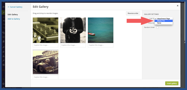
If you prefer a more hands-off approach, WordPress plugins can simplify the process of displaying different images on desktop and mobile devices. There are several plugins designed specifically for responsive images, offering user-friendly interfaces and powerful features.
Popular Plugins for Responsive Images
- WP Responsive Images – Automatically adds srcset and sizes attributes to your images, optimizing them for various devices.
- Adaptive Images for WordPress – Detects the device and serves appropriately sized images, helping with load times and bandwidth savings.
- Image Widget with Device Detection – Allows you to insert different images into widgets based on device type, perfect for sidebar or footer images.
How to Use a Responsive Image Plugin
Most plugins follow a simple installation process:
- Install and activate the plugin through your WordPress dashboard.
- Configure the plugin settings, often found under Settings or a dedicated menu.
- Upload your images or specify different images for desktop and mobile within the plugin interface.
- Insert the images or shortcodes into your posts or pages as instructed.
For example, some plugins let you specify images directly within the editor, and others automatically detect device type and serve the right image. This way, you don’t need to touch code, and you can manage everything from a visual interface.
Benefits of Using Plugins
- Ease of use – No coding required, perfect for non-technical users.
- Automation – Many plugins automatically optimize images for all devices.
- Enhanced Performance – Serve appropriately sized images to reduce load times.
Final Tips
When choosing a plugin, look for one that’s well-rated, regularly updated, and compatible with your version of WordPress. Also, test your site thoroughly after setting up to ensure images display correctly on all devices.
In summary, whether you prefer manual methods like CSS and PHP or want the convenience of plugins, WordPress offers flexible solutions for displaying different images on desktop and mobile. Pick the approach that works best for your skills and website needs, and you’ll deliver a better experience for all your visitors!
5. Implementing Custom Code for Device-Specific Images
So, you want to serve different images depending on whether your visitors are on a desktop or a mobile device? Great idea! It can really improve your site’s performance and user experience. The best way to do this is by adding some custom code to your WordPress site. Don’t worry—it’s easier than you might think, and I’ll walk you through it step by step.
First, the goal is to detect what device your visitor is using and then display the appropriate image. There are a couple of methods to do this, but here’s a straightforward approach using PHP and JavaScript.
Step 1: Prepare Your Images
Make sure you upload your desktop and mobile images to your media library or a dedicated folder. For example:
- Desktop Image: /images/your-image-desktop.jpg
- Mobile Image: /images/your-image-mobile.jpg
Step 2: Add PHP Code to Your Theme
You can add custom PHP code to your theme’s functions.php file or via a site-specific plugin. Here’s a simple snippet that outputs the correct image based on device detection:
<?phpfunction display_device_specific_image() { // Simple device detection using user agent $user_agent = $_SERVER['HTTP_USER_AGENT']; $is_mobile = preg_match('/Mobile|Android|BlackBerry|Opera Mini|IEMobile|WPDesktop/', $user_agent); if ($is_mobile) { // Show mobile image echo '<img src="' . get_template_directory_uri() . '/images/your-image-mobile.jpg" alt="Mobile Image" />'; } else { // Show desktop image echo '<img src="' . get_template_directory_uri() . '/images/your-image-desktop.jpg" alt="Desktop Image" />'; }}?>You can call this function directly in your post or page template where you want the image to appear, like so:
<?php display_device_specific_image(); ?>Step 3: Using JavaScript for More Precision
Sometimes, user agent detection isn’t perfect. A more reliable way is to use JavaScript to check the viewport width and swap images accordingly. Here’s an example:
<img id="responsive-image" src="images/your-image-desktop.jpg" alt="Responsive Image"><script>function updateImage() { var img = document.getElementById('responsive-image'); if (window.innerWidth < 768) { // Mobile img.src = 'images/your-image-mobile.jpg'; } else { // Desktop img.src = 'images/your-image-desktop.jpg'; }}// Run on page load and resizewindow.addEventListener('load', updateImage);window.addEventListener('resize', updateImage);</script>This method dynamically swaps images based on the viewport size, making it more flexible and responsive.
Summary
- Use PHP to detect device type via user agent for server-side rendering.
- Use JavaScript to swap images based on viewport width for client-side responsiveness.
- Combine both methods for the best user experience and accuracy.
Remember: Always back up your site before editing code, and test thoroughly on different devices to ensure everything works smoothly.
6. Best Practices for Optimizing Images for Different Devices
Optimizing images isn’t just about reducing file sizes; it’s about delivering the right image to the right device in the right way. Proper optimization can boost your site’s loading speed, improve SEO, and provide a better experience for your visitors. Here are some best practices to keep in mind when working with images for desktop and mobile:
1. Use Responsive Image Techniques
The <picture> element and srcset attribute allow browsers to choose the most appropriate image based on the device’s screen size and resolution. Here’s a simple example:
<picture> <source media="(max-width: 767px)" srcset="images/mobile-image.jpg"> <source media="(min-width: 768px)" srcset="images/desktop-image.jpg"> <img src="images/desktop-image.jpg" alt="Responsive Image"></picture>This method ensures that mobile devices load smaller images, reducing load times and data usage.
2. Compress and Optimize Your Images
Use tools like TinyPNG, ImageOptim, or Photoshop’s Save for Web feature to reduce image file sizes without sacrificing quality. Aim for:
- JPEGs for photographs
- PNGs for graphics with transparency
- WebP format for modern, efficient compression (supported by most browsers)
3. Serve Scaled Images
Ensure your images are scaled to their display size. Upload high-resolution images for retina displays but resize them appropriately using image editing tools. Serving images larger than needed will only slow down your site.
4. Use Lazy Loading
Lazy loading defers the loading of images until they are about to enter the viewport. WordPress 5.5+ has native lazy loading support, but you can also use plugins like Lazy Load by WP Rocket or a3 Lazy Load.
5. Test on Multiple Devices and Browsers
Always preview your website on various devices and browsers to ensure images appear correctly and load quickly. Tools like BrowserStack or Chrome DevTools device emulation can help.
6. Keep Accessibility in Mind
Always add descriptive alt text to your images. It improves SEO and makes your site more accessible to users with visual impairments.
Summary of Tips
| Best Practice | Why It Matters |
|---|---|
| Use srcset and picture tags | Delivers devices-optimized images automatically |
| Compress images before uploading | Reduces load times and bandwidth usage |
| Serve scaled images | Prevents unnecessary data transfer |
| Implement lazy loading | Speeds up initial page load |
| Test across devices | Ensures consistent appearance and performance |
By following these best practices, you’ll ensure your website loads faster, looks great on all devices, and provides a seamless experience for your visitors. Remember, optimizing images is an ongoing process—regularly review and update your images as your site evolves.
Conclusion
In today’s digital landscape, delivering a seamless user experience across all devices is essential. By leveraging responsive images and WordPress plugins, you can effectively display different images tailored for desktop and mobile users. This approach not only enhances visual appeal but also optimizes page load times and overall performance. Remember to test your website thoroughly on various devices to ensure images appear correctly and efficiently. Utilizing tools like WP Responsive Images or custom CSS techniques can make this process straightforward. Ultimately, implementing device-specific images is a valuable strategy to boost engagement, improve SEO, and provide a polished, professional look to your website. Stay mindful of image sizes and formats to maintain fast loading speeds, and regularly update your media to keep your site fresh and relevant.

