If you’re building a WordPress website with Elementor, you know how important it is to get your layout just right. One common challenge is adjusting the size of grids to fit your content perfectly — whether it’s a portfolio, blog posts, or product listings. Luckily, Elementor makes it pretty straightforward to tweak grid sizes to match your design vision. In this guide, we’ll walk through some simple tips and tricks to help you master grid sizing, so your site looks professional and polished. No matter your skill level, you’ll find these insights helpful to create a balanced, eye-catching layout.
Understanding Elementor’s Grid Layout Options
Before diving into adjustments, it’s essential to understand the different grid layout options that Elementor offers. Elementor primarily uses the Posts widget and the Portfolio widget for displaying grid-based content. Both widgets allow you to control how your items are arranged, but they do so in slightly different ways.
Here are some key options you’ll encounter:
- Number of Columns: This setting determines how many items appear side-by-side. Whether you want a simple two-column layout or a more dynamic multi-column grid, you can easily set this here.
- Items Per Page: Controls how many items are loaded and displayed at once, which can influence the grid’s overall size and scrolling experience.
- Spacing (Gutter): Adjusts the space between grid items. Increasing or decreasing gutter width can make your grid look more spacious or compact.
- Responsive Settings: Elementor allows you to customize grid layouts for desktop, tablet, and mobile views, ensuring your grids look great on all devices.
Another important aspect is understanding how the layout adapts when you change these settings. For example, increasing the number of columns will make your grid wider but might require you to adjust spacing or image sizes to keep everything balanced. Conversely, reducing the number of columns can create a more focused, less cluttered look.
By mastering these layout options, you gain greater control over how your content is presented, making your website more attractive and user-friendly. Think of these settings as the building blocks of your grid design — once you know what each does, you can tailor your layout to perfectly fit your content and style preferences.
3. Step-by-Step Guide to Changing Grid Sizes in Elementor
Ready to tweak your grid sizes but unsure where to start? No worries! Adjusting grid sizes in Elementor is pretty straightforward once you know the steps. Let’s walk through it together so you can get your layout just right.
Step 1: Open Your WordPress Dashboard
First, log into your WordPress admin panel. From there, go to the page or post where you want to modify your grid. Click on Edit with Elementor to launch the Elementor editor.
Step 2: Select the Grid Container
Once in Elementor, locate the section or container holding your grid. This could be a dedicated section, inner section, or a widget like the Posts widget. Click on it to bring up the editing panel.
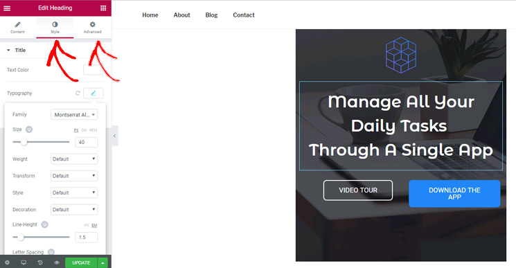
Step 3: Adjust the Layout Settings
With your grid container selected, look for the Layout tab in the editing sidebar. Here, you’ll find options related to columns, rows, and overall grid structure. For example, if you’re working with a Posts widget, you’ll see options like Columns and Rows.
Step 4: Change Number of Columns or Rows
- If your grid is based on columns, simply increase or decrease the number of columns to make the grid wider or narrower.
- For row adjustments, modify the number of rows if applicable, especially in nested or custom grids.
Step 5: Use Width and Gap Settings
Look for options like Column Width or Gutter Width. Adjust these sliders or input values to control spacing and sizing precisely. For example, decreasing gutter width will make your grid more compact.
Step 6: Preview and Save
Always preview your changes by clicking the eye icon. If you’re happy with the new size, hit Update to save your changes. Voila! Your grid should now reflect the new dimensions.
And that’s it! Changing grid sizes in Elementor is all about playing around with column numbers and spacing options. Experiment a little, and you’ll master the layout adjustments in no time.
4. Using Custom CSS to Fine-Tune Grid Dimensions
Sometimes, the built-in options in Elementor just aren’t enough to achieve that perfect look. That’s where custom CSS comes in! With a bit of CSS magic, you can fine-tune your grid’s size, spacing, and responsiveness to fit your design vision perfectly.
Why Use Custom CSS?
While Elementor offers a lot of flexibility, custom CSS allows you to go beyond default settings. Want to set specific widths, add unique spacing, or adjust how your grid responds on different devices? CSS is your best friend here.
Getting Started with Custom CSS
- Identify the element you want to modify. Use your browser’s developer tools (right-click the element and select “Inspect”) to find its CSS class or ID.
- Navigate to the Elementor editor, select the widget or section, and go to the Advanced tab.
- In the Custom CSS field, add your CSS code. Note: Custom CSS is available only in Elementor Pro.
Sample CSS Snippets for Grid Fine-Tuning
| Purpose | CSS Code |
|---|---|
| Set fixed grid width |
/ Target the grid container by class or ID /.selector { width: 80%; / Adjust to your desired width / max-width: 1200px; / Optional max width for large screens / margin: 0 auto; / Center the grid /}
|
| Adjust column gap |
/ Target the grid or container holding columns /.selector { grid-column-gap: 20px; / Space between columns / grid-row-gap: 20px; / Space between rows /}
|
| Change individual column widths |
/ For CSS Grid containers, specify column sizes /.selector { display: grid; grid-template-columns: 1fr 2fr 1fr; / Adjust as needed /}
|
Tip: Use the Inspect Element tool often to see how your CSS affects the grid in real-time. Tweak values until you get the perfect size and spacing.
Remember, CSS gives you endless possibilities to customize your grids exactly how you want. Just be cautious—small changes can sometimes have big impacts, so always preview your site on different devices after applying custom CSS.
In summary, combining Elementor’s visual controls with custom CSS empowers you to create highly customized, responsive grids. Don’t hesitate to experiment and find what works best for your website’s design!
5. Best Practices for Responsive Grid Design in Elementor
Designing a responsive grid in Elementor isn’t just about making things look good on your desktop — it’s about ensuring your website shines on all devices, from smartphones to large monitors. Here are some best practices to help you create flexible and visually appealing grids that adapt seamlessly:
- Start with a mobile-first approach: When you design your grid, consider how it will look on smaller screens first. Then, gradually adjust for larger screens. Elementor’s responsive controls make this process straightforward.
- Use percentage-based widths: Instead of fixed pixel widths, opt for percentages or fractional units. This allows grids to resize fluidly as the viewport changes.
- Leverage Elementor’s responsive controls: In the editor, you can toggle between Desktop, Tablet, and Mobile views. Adjust column numbers, spacing, and other settings specifically for each device to optimize the user experience.
- Set flexible gaps and spacing: Use Elementor’s gap controls with relative units like rem or em rather than fixed pixels. This ensures consistent spacing across devices and improves overall responsiveness.
- Test frequently on real devices: While Elementor previews are helpful, always double-check your grid on actual devices or emulators. This helps catch issues like overlapping or cramped content early.
Remember, a well-designed responsive grid isn’t just about aesthetics — it’s about usability. Keep your content accessible, legible, and easy to navigate, regardless of the device your visitors are using.
6. Common Issues When Adjusting Grid Sizes and How to Fix Them
Even with the best intentions, adjusting grid sizes in Elementor can sometimes lead to unexpected problems. Here are some common issues you might encounter and simple ways to fix them:
Issue 1: Content Overlapping or Clipping
What happens: When grid columns are too narrow or spacing isn’t set properly, content can overlap or be cut off, making your site look messy.
How to fix: Check your column widths and ensure they’re set to flexible units like percentages. Also, review padding and margin settings — sometimes reducing unnecessary spacing can solve the problem. Use Elementor’s responsive controls to tweak these settings on different devices.
Issue 2: Uneven Spacing Between Items
What happens: Gaps between grid items look inconsistent, which can disrupt the visual flow.
How to fix: Use Elementor’s gap controls with relative units, and consider setting uniform margins for grid items. For more control, add custom CSS if needed, but start with the built-in options.
Issue 3: Grid Items Not Resizing Properly
What happens: When you change grid sizes, some items may not resize as expected, leaving blank spaces or overlapping.
How to fix: Double-check the column settings for each device, ensuring that the widths are set to auto or percentages. Also, avoid fixed heights unless necessary, and consider using min/max height settings for better flexibility.
Issue 4: Layout Breaks on Smaller Screens
What happens: Your grid looks fine on desktop but falls apart on mobile or tablet devices.
How to fix: Use Elementor’s responsive editing to customize the layout for each device. Reduce the number of columns, adjust spacing, or switch to a stacked layout for mobile views.
Issue 5: Slow Loading Due to Large Grid Files
What happens: Large images or complex grids can slow down your site, affecting user experience and SEO.
How to fix: Optimize images, limit the number of grid items, and avoid overly complex layouts. Lazy load images and consider using lightweight widgets or custom CSS for better performance.
By being aware of these common issues and knowing how to troubleshoot them, you can create stunning, flexible grids that enhance your website’s look and functionality. Remember, patience and testing are key — don’t be afraid to experiment with different settings until everything looks just right!
7. Additional Tips for Optimizing Grid Layouts for Better User Experience
Now that you’ve got the basics of adjusting grid sizes down, it’s time to take your layouts to the next level by optimizing for a seamless user experience. After all, a beautiful grid is great, but if it doesn’t work well for your visitors, then it’s not doing its job. Here are some practical tips to make your grids both visually appealing and user-friendly.
Prioritize Responsiveness. Remember, your visitors will be browsing on a variety of devices—from desktops to smartphones. Make sure your grid adjusts smoothly across different screen sizes. Use Elementor’s responsive controls to tweak grid columns for mobile, tablet, and desktop views separately. Keep testing on actual devices or emulators to see how your grid behaves.
Maintain Consistent Spacing and Alignment. Consistent gaps between grid items create a clean, professional look. Use Elementor’s spacing controls to set uniform margins and paddings. Also, align your items vertically and horizontally where possible, so users find it easy to scan and navigate your content.
Optimize Image Sizes. Large images can slow down your page load times, which impacts user experience and SEO. Use appropriately sized images for grid items, and consider lazy loading techniques to improve performance. Remember, faster sites keep visitors engaged longer.
Use Clear Call-to-Action Buttons. If your grid includes products, services, or content links, make sure your buttons or links are prominent and easy to click. Consistent styling, sufficient padding, and contrasting colors help users interact smoothly without confusion.
Test and Gather Feedback. Don’t just set and forget your grid layouts. Regularly review how users interact with your site. Use analytics tools to see which grid items get the most clicks or engagement. Consider asking friends or colleagues for feedback on usability and visual appeal. Small adjustments based on real user behavior can significantly boost your layout’s effectiveness.
By applying these tips, you’ll ensure your grid layouts aren’t just pretty—they’re optimized for real-world use, making your website more engaging, accessible, and enjoyable for visitors. Remember, the key is continuous improvement and keeping the user experience at the forefront of your design process.
8. Conclusion and Final Thoughts on Mastering Grid Adjustments in Elementor
Congratulations! You’re now equipped with the knowledge to confidently adjust and optimize grid layouts in Elementor. Mastering these skills allows you to create visually stunning, highly functional pages that look great on any device. Whether you’re showcasing a portfolio, building an online store, or designing a blog, flexible grid layouts are a powerful tool in your WordPress toolkit.
Remember, the key to success lies in understanding your content and audience. Play around with different grid sizes, spacing, and alignment options to see what works best for your specific needs. Don’t be afraid to experiment—sometimes the best designs come from trying new things and refining based on feedback.
Keep in mind these final tips:
- Stay responsive: Always check how your grids look on various screens.
- Use visual hierarchy: Adjust sizes and spacing to guide users naturally through your content.
- Optimize performance: Use optimized images and minimize unnecessary elements.
- Gather feedback: Regularly review user interactions to make informed adjustments.
With patience and practice, mastering grid adjustments in Elementor becomes second nature. It opens up endless possibilities for creative and functional website layouts that captivate visitors and enhance their experience. So keep experimenting, stay curious, and watch your website’s design skills grow!