Hey there! If you’re running a WordPress site, you probably know how important it is to have a mobile-friendly theme. With more folks surfing the web on their phones, ensuring your site looks good on smaller screens can make all the difference. In this post, we’ll guide you on how to test if your WordPress theme is mobile-friendly and why it matters. Let’s dive in!
Why Mobile-Friendliness Matters

So, you might be wondering, why should I care if my WordPress theme is mobile-friendly? Well, let me break it down for you:
- User Experience: A website that isn’t optimized for mobile can be frustrating to navigate. If visitors struggle to browse your site, they’re likely to leave quickly, resulting in a high bounce rate.
- SEO Benefits: Google loves mobile-friendly sites! They prioritize them in search results, which can mean more visibility and traffic for you.
- Increased Engagement: When your site looks great and loads quickly on mobile devices, users are more likely to stick around, explore your content, and take the actions you want them to take.
- Competitive Advantage: Many sites are still not optimized for mobile. Being mobile-friendly can set you apart from competitors who haven’t made the transition yet.
- Future-Proofing: With mobile usage continuing to rise, ensuring your site is mobile-friendly is not just a trend, it’s essential to staying relevant in an evolving digital landscape.
In short, a mobile-friendly theme isn’t just nice to have; it’s crucial for your website’s success. Ready to discover how to test your theme? Let’s get started!
Method 1: Using Google’s Mobile-Friendly Test Tool
If you’re looking for a quick and reliable way to see if your WordPress theme is mobile-friendly, Google’s Mobile-Friendly Test Tool is just the right option. This free web-based tool is designed to help you check how easily users can access your content on mobile devices. Plus, it gives you insights that can improve your site’s performance on phones and tablets.
Here’s how you can get started:
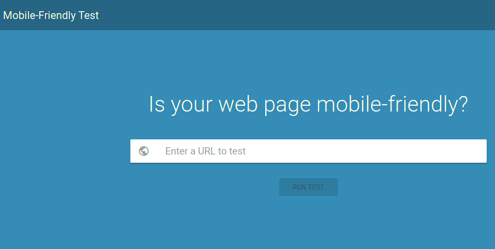
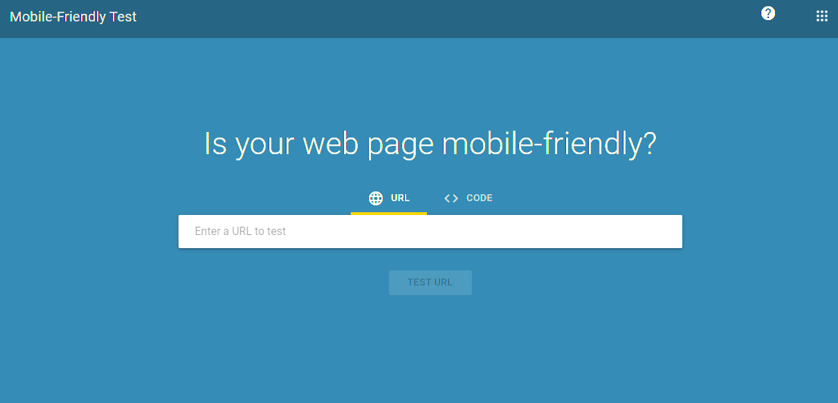
- Visit the Google Mobile-Friendly Test Tool page.
- Enter the URL of your WordPress site or the specific page you want to test.
- Click on the “Run Test” button and wait a few seconds.
- Review the results!
Understanding the Results: After testing, you will receive a comprehensive report that includes:
- A mobile-friendly score (either “Mobile-Friendly” or “Not Mobile-Friendly”)
- Suggestions for improving your site’s mobile usability
- A screenshot of what your page looks like on a mobile device
Using Google’s tool not only informs you about your theme’s responsiveness but also provides actionable insights to enhance your site. It’s a crucial step to ensure your audience has a smooth browsing experience, no matter what device they use!
Method 2: Testing on Actual Mobile Devices
While online testing tools are helpful, nothing quite compares to seeing your WordPress theme in action on actual mobile devices. This method allows you to experience firsthand how your site performs and looks on different screens. Testing across various mobile platforms ensures comprehensive feedback that automated tools may overlook.
Here’s how you can do it:
- Gather Devices: Collect various mobile devices, including smartphones and tablets from different brands (e.g., iOS, Android).
- Review Key Pages: Open key pages of your site that receive the most traffic, such as the homepage, product pages, and blog posts.
- Navigate and Interact: Pay attention to how the layout adapts. Are buttons easily clickable? Is text legible? Can you easily navigate through the site? Take notes on your experience.
- Check Performance: Look for any loading issues or glitches as you navigate. A slow or malfunctioning site can deter mobile users, leading to a poor user experience.
Benefits of Testing on Actual Devices:
- You gain insight into user experience, including how intuitive your site is.
- You can observe how images and text render on smaller screens.
- Testing on multiple devices helps identify issues that may not surface on desktop versions.
By combining tools like Google’s Mobile-Friendly Test with actual device testing, you’re well on your way to ensuring your WordPress theme provides an optimal experience for all users!
Method 3: Responsive Design Check with Browser Developer Tools
If you’re looking to determine whether your WordPress theme is mobile-friendly, using your browser’s Developer Tools is a great hands-on method. Most modern browsers like Chrome, Firefox, and Safari come equipped with comprehensive developer tools that allow you to tweak and inspect your website dynamically.
Here’s how to utilize these features:
- Open Developer Tools: Right-click anywhere on your webpage and select “Inspect” or simply press
F12orCtrl + Shift + I. This will open up a panel usually at the bottom or right side of your browser. - Toggle Device Toolbar: Click on the device icon (it looks like a tablet and a phone) to activate Responsive Design Mode. This allows you to view your website as it would appear on different devices.
- Select Different Devices: You can select from a list of predefined devices (like iPhone, iPad, and various Android phones) or enter custom screen sizes to test how your theme adapts.
- Zoom and Orientation: For accurate testing, you can rotate the device to see how your layout handles landscape versus portrait modes.
- Inspect Elements: Hover over elements to see how they respond. Check for issues like menu overlaps, font readability, and image resizing.
This tool not only helps you understand how well your WordPress theme responds to smaller screens but also allows you to identify potential areas for improvement before you hit ‘publish’. So, grab your favorite browser and start exploring!
Method 4: Using Online Responsive Design Testing Tools
If you’re a visual learner or simply prefer dedicated tools, several online platforms can help you assess how your WordPress theme performs on mobile devices. These tools can simulate your website on multiple devices and screen sizes, providing you with a broader overview of responsiveness without needing to use a browser’s Developer Tools.
Here are some popular online responsive design testing tools:
| Tool Name | Description | Key Features |
|---|---|---|
| Responsinator | This tool shows how your site appears on specific device viewports. |
|
| Viewport Resizer | A Chrome extension that allows you to test your site in multiple sizes quickly. |
|
| Screenfly | Allows you to see how your website appears on various screen sizes and devices. |
|
Using these tools can be incredibly insightful, as they not only show you how your site looks but also help you spot potential usability issues that might affect mobile users. Take the time to explore these tools — you’ll be glad you did when your site impresses visitors across all devices!
How to Analyze and Interpret Test Results
Once you’ve put your WordPress theme through its paces using various testing tools, it’s time to make sense of those numbers and insights. Analyzing and interpreting your test results can reveal a lot about how mobile-friendly your theme truly is. The process might seem daunting initially, but once you get the hang of it, you’ll find it quite intuitive!
Here are some key steps to help you analyze your results:
- Score Overview: Most testing tools provide a score based on various criteria. A score closer to 100% indicates excellent mobile usability. If your score is below 70%, it might be time to consider some changes.
- Identify Issues: Look for specific issues highlighted in your results. Tools typically categorize problems, such as text size, tap target size, or viewport configuration. Each of these plays a crucial role in user experience.
- Prioritize Fixes: Not all issues are created equal. Focus on critical issues impacting user experience first. For instance, if a button is too small to click, users may have trouble navigating, leading to higher bounce rates.
- Compare Results: If you’ve tested multiple themes or made updates to the same theme, comparing results can help you understand the effect of your changes. Keep track of these variations to see improvements over time.
Finally, don’t forget to keep user experience at the forefront. You’ll want to ensure that your theme not only passes tests but also provides an enjoyable experience for visitors on all devices.
Common Mobile Usability Issues in WordPress Themes
As you refine your WordPress theme to make it mobile-friendly, it’s essential to know some common mobile usability issues that many users encounter. Understanding these pitfalls can guide you in testing and optimizing your theme effectively.
| Issue | Description | Solution |
|---|---|---|
| Small Text Size | If your site’s text is too small, users will struggle to read it on their mobile devices. | Ensure that text sizing is adjustable and adheres to recommended mobile readability standards. |
| Unresponsive Images | Images that don’t adjust to screen sizes can break layouts and slow loading times. | Use CSS techniques to make images responsive and optimize them for faster loading. |
| Tiny Clickable Elements | Buttons and links that are too small can lead to frustrating navigation experiences. | Ensure tap targets are large enough to be easily clickable, usually no less than 48×48 pixels. |
| Viewport Configuration | Without proper configuration, mobile browsers might display your website incorrectly. | Use responsive design principles and ensure that the viewport meta tag is set up properly. |
Being aware of these common issues empowers you to create a smoother, more user-friendly mobile experience for your audience. With consistent testing and a willingness to adapt, your WordPress theme can shine on any device!
Conclusion and Next Steps
Testing if your WordPress theme is mobile-friendly is crucial for ensuring that your website provides an optimal user experience across all devices. With the increasing number of users accessing websites via mobile devices, having a responsive design can significantly improve engagement and conversions. Here are key takeaways and actions you can take:
- Utilize Online Tools: Websites like Google’s Mobile-Friendly Test and GTmetrix can help assess your theme’s responsiveness and loading speed.
- Manual Testing: Regularly check your website on various mobile devices and screen sizes to see how it appears in different scenarios.
- Check for Touch Elements: Ensure buttons and links are easily tappable to enhance user interaction on mobile devices.
- Optimize Images: Use properly sized images to reduce load times and improve performance on mobile.
- Consider a Child Theme: If your current theme isn’t mobile-friendly, consider creating a child theme or switching to a more responsive option.
Next, ensure that your content is easily accessible and navigable on mobile devices. Regularly review your analytics to understand mobile user behavior and make adjustments as necessary. If you’re facing challenges in achieving mobile optimization, consider consulting with a web development professional for tailored solutions.
In conclusion, prioritizing a mobile-friendly WordPress theme is essential for success in the digital landscape. By following the steps outlined above, you can create a website that not only looks great but functions effectively on any device.


