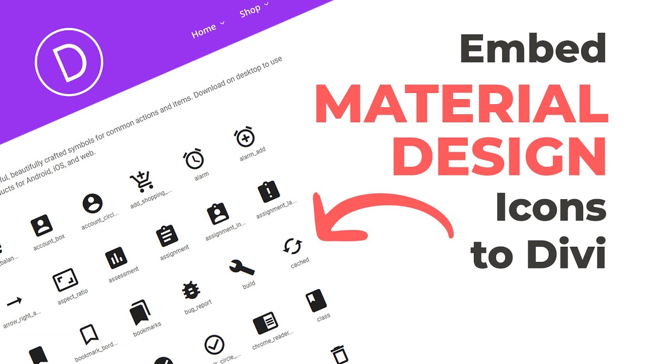
If you’re looking to spice up your WordPress website with some sleek, modern icons, Google Material Icons are a fantastic choice. Designed by Google, these icons are clean, versatile, and easy to customize, making them perfect for various website styles. Now, if you’re using Divi—a popular WordPress theme and page builder—you’ll be glad to know that integrating these icons is straightforward. Divi offers flexible design options, and adding Material Icons can enhance your site’s visual appeal and user experience. In this guide, we’ll walk through how to seamlessly add Google Material Icons to your Divi-powered site, so your pages look polished and professional.
Why Use Google Material Icons in Your WordPress Site
Using Google Material Icons on your WordPress site offers several benefits that can truly elevate your website’s look and feel. First and foremost, these icons are free and widely supported, meaning you don’t have to worry about licensing issues or compatibility. They come with a comprehensive library of over 900 icons, covering everything from navigation arrows to social media logos, providing you with plenty of options to match your site’s style.
Another great reason to use Material Icons is their visual consistency. Designed by Google following Material Design principles, these icons have a clean, minimalistic aesthetic that works well across different devices and screen sizes. They help create a cohesive user experience, making your site look modern and professional.
Moreover, Google Material Icons are highly customizable. You can change their size, color, and even add animations to make your site more engaging. Since they are vector-based, they scale perfectly without losing quality—whether on a small mobile screen or a large desktop monitor.
In addition to aesthetics, incorporating these icons can improve site navigation and usability. Clear icons next to menu items, buttons, or links can guide visitors intuitively through your content. This visual cue can increase engagement and help visitors find what they’re looking for faster.
Finally, integrating Google Material Icons into your Divi-powered site is a straightforward process that doesn’t require advanced coding skills. With just a few simple steps, you can start enhancing your website right away. Overall, whether you want to add a touch of modern design or improve navigation, Google Material Icons are a smart choice for your WordPress site.
3. Step-by-Step Guide to Adding Google Material Icons in Divi
So, you’re ready to spice up your website with some Google Material Icons using Divi? Great choice! These icons are modern, versatile, and super easy to add if you follow the right steps. Let’s walk through the process together so you can get those icons up and running smoothly.
Step 1: Enqueue Google Material Icons Font
First things first, you need to load the Material Icons font onto your website. This involves adding a little bit of code to your WordPress functions.php file or using a plugin that allows custom code snippets.
- Go to your WordPress dashboard and navigate to Appearance > Theme Editor.
- Open the functions.php file of your child theme (it’s best to use a child theme to avoid losing changes during updates).
- Add this code snippet at the end:
<?php function add_material_icons() { wp_enqueue_style( 'material-icons', 'https://fonts.googleapis.com/icon?family=Material+Icons', array(), null ); } add_action( 'wp_enqueue_scripts', 'add_material_icons' ); ?>
This code loads the Material Icons font from Google Fonts, making it available throughout your site.
Step 2: Use Icons in Divi Modules
Now that the font is loaded, you can start adding icons to your Divi layouts. You have a few options: using the Text module, Button module, or even custom HTML modules.
- Using the Text Module: In the Divi Builder, add a Text module where you want the icon.
- Insert Icon HTML: Inside the Text module, add the following HTML where you’d like the icon to appear:
<span class="material-icons">icon_name</span>
Replace icon_name with the name of the icon you want. For example, for a home icon, write home.
Here’s a quick example:
<span class="material-icons">favorite</span> Like this!
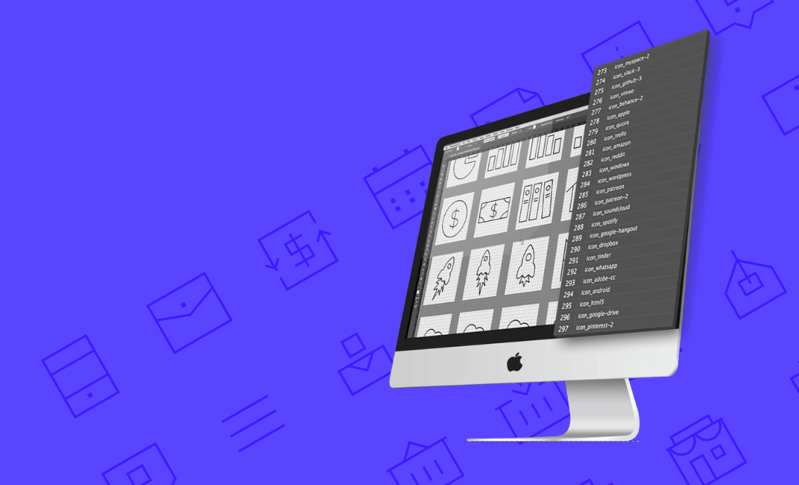
Step 3: Find Your Icons
Need some inspiration? Visit the Google Material Icons library. Search for icons you love, copy their names, and plug them into your code.
Step 4: Save and Preview
Once you’ve added your icon code, save your module and preview your page. Your icon should appear perfectly styled next to your text or button. If it doesn’t show up, double-check that you’ve added the font enqueue code correctly and used the right icon name.
4. Customizing Icons in Divi for Better Design Integration
Adding icons is just the beginning! To make them really pop and match your site’s style, you’ll want to customize their appearance. Luckily, Google Material Icons are very flexible and can be styled with CSS to fit your design seamlessly.
Adjusting Size and Color
The easiest way to customize icons is through inline styles or custom CSS. Here are some quick tips:
- Change size: Use the font-size property.
- Change color: Use the color property.
For example, update your icon HTML like this:
<span class="material-icons custom-icon">face</span>
And add some CSS in your custom CSS area (Divi > Theme Options > Custom CSS):
.custom-icon { font-size: 36px; color: ff6347; / Tomato red, but you can pick any color /}
Using CSS for Advanced Styling
If you want your icons to have hover effects, animations, or other fancy styles, CSS is your friend. Here are some ideas:
- Hover Color Change:
.custom-icon:hover { color: 00bfff; / Deep sky blue on hover /}
- Adding Shadows:
.custom-icon { text-shadow: 2px 2px 4px rgba(0,0,0,0.3);}
Aligning Icons with Text
Sometimes, you want your icons to align perfectly with your text for a polished look. You can do this with Flexbox or vertical-align properties. Here’s an example using inline styles:
<span class="material-icons" style="vertical-align: middle; font-size: 24px; color: 333;">build</span> <span style="vertical-align: middle;">This is a construction icon!</span>
Responsive Considerations
Make sure your icons look good on all devices. Use relative units like em or rem for font size, and test on different screen sizes. Divi’s built-in responsive options can help you tweak icon sizes specifically for mobile or tablet views.
Summary
Customizing Google Material Icons in Divi is straightforward and opens up endless possibilities for enhancing your site’s visual appeal. By adjusting size, color, adding effects, and aligning them thoughtfully, you can make your icons not just functional but also an integral part of your design aesthetic. Play around with CSS, and you’ll be surprised how seamlessly these icons can blend into your overall website look!
5. Tips for Using Google Material Icons Effectively on Your Website
Now that you know how to add Google Material Icons to your WordPress site using Divi, let’s talk about how to make the most of these icons. After all, icons aren’t just decorative—they’re a powerful way to improve user experience, guide visitors, and make your website look polished and professional.
Here are some handy tips to ensure your icons work for you:
1. Keep It Consistent
Use a consistent style for your icons across your website. Whether you choose outlined, filled, or rounded icons, sticking with one style helps create a cohesive look. Google Material Icons come in various styles, so pick one that matches your branding and use it uniformly.
2. Use Icons to Enhance Navigation
Icons are great for making navigation menus more intuitive. For example, add a home icon to your homepage link or a contact icon next to your contact info. This visual cue helps visitors find what they need faster and improves overall usability.
3. Don’t Overdo It
While icons are fantastic, too many can clutter your design and overwhelm visitors. Use icons sparingly—highlight important actions or sections, but avoid stuffing every button or link with icons. A well-placed icon can be more effective than a bunch of cluttered visuals.
4. Consider Accessibility
Make sure your icons are accessible to everyone. Use descriptive alt text or ARIA labels so screen readers can interpret what each icon represents. This ensures your site remains inclusive and user-friendly for all visitors.
5. Test for Responsiveness
Icons should look good on all devices. Check how your icons scale on mobile screens and tablets. Divi and Google Material Icons are responsive by default, but it’s always good to preview your site on different devices to ensure everything appears crisp and clear.
6. Match Icons to Content
Choose icons that clearly relate to the content or action. For example, use a trash bin icon for delete actions or a pencil for editing. Clear, intuitive icons help visitors understand functions without confusion.
7. Customize When Needed
If you want your icons to match your branding colors or style, you can easily customize their size, color, or hover effects with custom CSS. This way, your icons can integrate seamlessly into your design.
6. Troubleshooting Common Issues When Incorporating Icons
Sometimes, despite your best efforts, things don’t go as planned. Maybe the icons aren’t showing up, or they look weird. Don’t worry—many common issues are easy to fix once you know what to look for. Here are some typical problems and how to solve them:
Problem 1: Icons Not Displaying
- Possible Cause: The icon font isn’t loaded properly.
- Solution: Double-check that you’ve added the correct Google Fonts link or CDN link in your custom code. Make sure your code snippets are correctly placed in the Divi code modules or theme settings.
Problem 2: Icons Are Broken or Show as Squares
- Possible Cause: Font family isn’t specified, or CSS conflicts.
- Solution: Ensure your CSS explicitly sets the font-family to ‘Material Icons’. For example:
.material-icons { font-family: 'Material Icons'; font-weight: normal; font-style: normal; font-size: 24px; / adjust size as needed / display: inline-block; line-height: 1; text-transform: none; letter-spacing: normal; word-wrap: normal; white-space: nowrap; direction: ltr; -webkit-font-feature-settings: 'liga'; -webkit-font-smoothing: antialiased;}
Problem 3: Icons are Too Small or Too Large
- Possible Cause: CSS size settings.
- Solution: Adjust the font-size property in your CSS or inline styles. For example, increase or decrease the size to fit your design.
Problem 4: Icons Overlap or Disrupt Layout
- Possible Cause: Margin or padding issues or conflicting CSS rules.
- Solution: Inspect the element using browser developer tools to identify conflicting styles. Adjust margins or paddings accordingly, or add custom CSS to fix spacing issues.
General Tips for Troubleshooting
- Clear your browser cache after making changes.
- Ensure all code snippets are correctly placed in Divi modules or theme files.
- Use browser developer tools (F12 or right-click > Inspect) to see if the icon font loads properly and if CSS styles are applied correctly.
- If you’re using a caching plugin, clear the cache to ensure your changes appear.
Remember, most icon issues boil down to small CSS or loading errors. With a bit of patience and the right tools, you can quickly troubleshoot and get your icons looking perfect. Happy designing!
7. Additional Resources and Where to Find More Icons
If you’re excited about exploring even more icons to spice up your WordPress site, you’re in luck! There are plenty of resources out there that can help you discover a wide variety of icons beyond the default Google Material Icons. Whether you’re looking for icons that match your brand style or unique illustrations to make your site stand out, these resources are worth checking out.
Official Google Material Icons Library: The best starting point is the Google Material Icons library itself. It offers a comprehensive collection of icons that you can easily browse, search, and customize. Plus, they’re free and maintained by Google, so you know you’re getting quality icons.
Font Awesome: This popular icon toolkit offers thousands of icons in various styles. You can use them for free or opt for a pro version with even more options. Font Awesome is easy to integrate with WordPress and works well with Divi, especially if you want a diverse set of icons.
Icons8: If you want icons that are more illustrative or themed, Icons8 provides a vast collection, including icons in different styles, colors, and formats. They also offer a handy online editor to customize icons before downloading.
IconScout and Flaticon: These platforms host millions of icons, vectors, and illustrations. They often offer free icons with attribution or premium options for a more extensive library. You can search by style, color, or theme to find the perfect icon for your project.
When choosing icons, consider the following tips:
- Consistency: Stick to a style or set of icons that match your website’s aesthetic.
- Clarity: Make sure icons are easily understandable and relevant to the content.
- Performance: Use optimized icons to keep your site fast. Avoid overly complex or large icons that can slow down load times.
Most of these resources provide SVG, PNG, or font formats. For Divi and WordPress, SVG icons are often the most flexible, allowing for easy styling and responsiveness. Remember, adding icons is not just about looks—it’s about enhancing usability and user experience too!
8. Conclusion and Final Tips for Enhancing Your WordPress Site with Icons
Adding Google Material Icons to your WordPress site using Divi is a straightforward process that can significantly boost your website’s visual appeal and usability. With a little bit of setup, you can incorporate icons that guide your visitors, highlight important content, and give your site a modern, professional look.
Here are some final tips to keep in mind as you enhance your site with icons:
- Keep it simple: Use icons sparingly and strategically. Too many icons can clutter your design and distract visitors.
- Match your style: Choose icons that align with your website’s overall aesthetic and branding. Consistency is key to a polished look.
- Optimize for performance: Use SVG icons whenever possible for faster load times and better scalability.
- Accessibility matters: Ensure icons are accessible by providing alternative text (ARIA labels) when necessary, especially if they convey important information.
- Stay updated: Keep your icon libraries current and explore new icons regularly to keep your site fresh and engaging.
Remember, icons are more than just decorative elements—they’re powerful tools to improve navigation, communicate ideas quickly, and create a memorable user experience. With the tips and resources shared, you’re well on your way to transforming your WordPress site into a sleek, user-friendly platform that visitors will love. Happy designing!