If you’ve ever wondered how to give your WordPress website a little extra breathing room or tighten things up visually, adjusting the padding is a great way to do it. Padding controls the space inside an element, like around your text or images, making your site look cleaner and more polished. Whether you’re customizing a theme or tweaking some CSS, understanding how to change bottom padding can really enhance your site’s design. Don’t worry if you’re new to CSS—it’s easier than you think, and once you get the hang of it, you’ll be able to fine-tune your site with confidence.
Understanding CSS Padding Properties
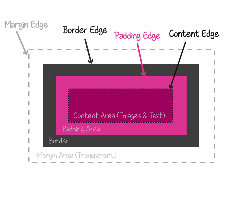
CSS padding is all about creating space inside an element, between its content and its border. It’s a fundamental part of CSS box model, which also includes margins and borders. When you want to change the bottom padding specifically, you target that side using the padding-bottom property.
Here’s a quick rundown of how padding works:
- padding-top: space above the content
- padding-right: space on the right side
- padding-bottom: space below the content
- padding-left: space on the left side
You can set padding in different units, like pixels (px), ems (em), percentages (%), or viewport units (vw, vh). For example:
| CSS Property | Example | Description |
|---|---|---|
| padding-bottom | 20px | Sets bottom padding to 20 pixels |
| padding: 10px 15px 20px 25px; | Top, right, bottom, left | Sets padding for all sides in shorthand |
| padding: 5%; | 5% | Applies 5% padding on all sides relative to element’s width/height |
When customizing your WordPress site, you often add CSS via the Customizer, child themes, or plugins. Knowing how to target specific elements and adjust their padding allows you to control spacing precisely, making your website look just right.
3. Targeting Specific Elements for Bottom Padding Adjustment

When you’re customizing your WordPress site, you might find that you want to adjust the bottom padding for particular elements rather than applying a blanket change across your entire site. This is where targeting specific elements with CSS becomes super handy. Instead of affecting everything, you can zero in on just the header, footer, sidebar, or even individual widgets, making your design more precise and tailored.
So, how do you target these elements? It all starts with inspecting your site’s HTML structure. Most browsers have a built-in developer tool that lets you do this easily. For example, in Chrome, you can right-click on the element you want to modify and select “Inspect.” This opens up the developer panel, showing the HTML and CSS associated with that element.
Once you’ve identified the element’s selector — which could be a class, ID, or even a tag — you can write CSS rules specifically for it. Here are some common ways to target elements:
- By Class: If your element has a class like
.footer-widget, you can target it with.footer-widget { padding-bottom: 20px; } - By ID: An element with an ID like
main-headercan be targeted withmain-header { padding-bottom: 15px; } - By Tag: For generic tags like
divorsection, be more specific with classes or IDs to avoid affecting unintended elements.
Sometimes, you might want to target multiple elements at once. You can do this by comma-separating your selectors:
.header, .footer, .sidebar { padding-bottom: 30px; }Remember, the key is specificity. The more specific your selector, the less likely it is to affect other parts of your site. Also, keep in mind that some themes and plugins add their own classes, so it’s a good idea to inspect your site regularly when making adjustments.
4. Adding Custom CSS to Your WordPress Site
Now that you know how to target specific elements for bottom padding adjustments, the next step is actually adding your custom CSS to your WordPress site. There are several easy ways to do this, depending on your comfort level and the tools you’re using.
Option 1: Using the Customizer
WordPress has a built-in feature that allows you to add custom CSS without touching any files:
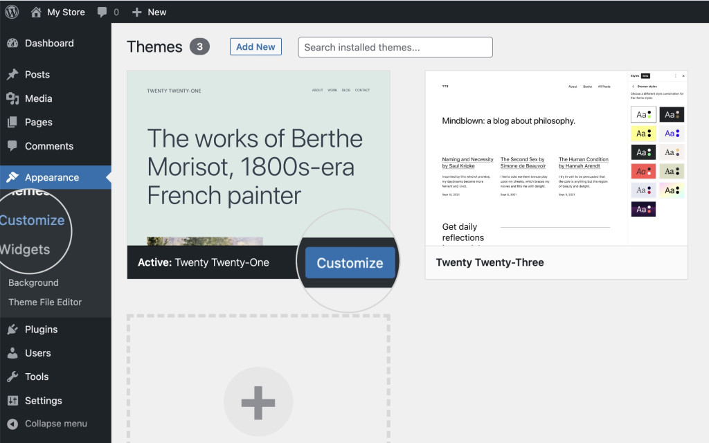
- Go to Appearance > Customize in your WordPress dashboard.
- Click on Additional CSS.
- Here, you can write your CSS code directly. For example:
- As you type, you’ll see the changes previewed in real-time. When you’re happy, click Publish.
.footer-widget { padding-bottom: 40px; }Option 2: Using a Child Theme’s stylesheet
If you’re comfortable editing theme files, this method is more robust and keeps your customizations intact during theme updates:
- Create a child theme if you haven’t already (this prevents your changes from being overwritten).
- Locate the
style.cssfile within your child theme folder. - Add your custom CSS at the bottom of this file, like so:
- Save your changes, and refresh your website to see the updates.
/ Custom bottom padding for footer widget /.footer-widget { padding-bottom: 50px;}Option 3: Using a Custom CSS Plugin
If you prefer not to handle theme files or the Customizer, a dedicated plugin like Simple Custom CSS or Custom CSS & JS can do the trick. Install and activate the plugin, then add your CSS rules through their interface.
Whichever method you choose, the goal is to inject your CSS in a way that’s easy to manage and unlikely to be lost during theme updates. Always remember to clear your cache after making changes so you can see the latest results.
By carefully targeting elements and adding your custom CSS, you gain much more control over your site’s appearance. Adjusting bottom padding, in particular, can help create a cleaner, more balanced layout that matches your design vision perfectly.
5. Using the WordPress Customizer or Theme Editor
If you’re not super comfortable working directly with CSS files, don’t worry—you can still make changes using the WordPress Customizer or Theme Editor. These tools are user-friendly and perfect for quick tweaks without diving into code files directly.
Here’s how you can do it:
- Access the Customizer: Log in to your WordPress dashboard, then go to Appearance → Customize. This opens the WordPress Customizer, where many themes offer options to tweak your site’s look.
- Look for Additional CSS: Most themes have a section called Additional CSS. Click on it to add your custom CSS code right there. It’s a safe space to experiment without risking your theme’s core files.
- Add Your Padding Code: In the CSS box, write your CSS rules to target the element you want to adjust. For example, if your footer has a class of `.footer`, you might add:
.footer { padding-bottom: 20px;}Tip: Use the browser’s Inspect tool (Right-click on the element and select “Inspect”) to find the exact class or ID you need to target, making your CSS more precise.
- Publish Your Changes: Once you’re happy with the tweaks, click Publish. Your site will update immediately with the new bottom padding.
If your theme supports the Theme Editor, you can also modify style sheets directly. But be cautious—making changes here can affect your entire site, and mistakes might cause display issues. Always back up your site before editing theme files.
6. Examples of Changing Bottom Padding in CSS
Let’s look at some real-world examples to help you understand how to change bottom padding in CSS. Remember, the idea is to target the specific element you want to adjust and set its padding-bottom property.
Example 1: Basic Bottom Padding Adjustment
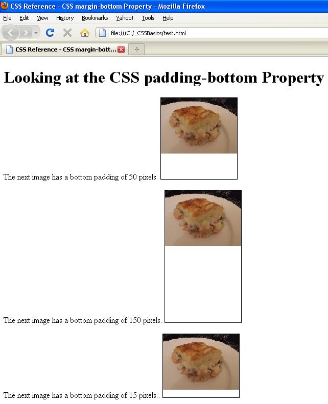
/ Target footer element by class and add bottom padding /.footer { padding-bottom: 30px;}This will add 30 pixels of space below your footer content. Adjust the value to increase or decrease the space as needed.
Example 2: Targeting a Specific Section
/ Add bottom padding only to the contact section /contact-section { padding-bottom: 50px;}Here, we’re targeting an element with ID contact-section. Use this method if you want to be precise, so only that section’s bottom padding changes.
Example 3: Combining Padding with Other Properties
/ Increase bottom padding and add a background color for emphasis /.content-area { padding-bottom: 40px; background-color: f0f0f0;}This example not only adjusts the bottom padding but also adds a subtle background color, making the section stand out.
Example 4: Using CSS Variables for Flexibility
:root { --bottom-padding: 25px;}.header { padding-bottom: var(--bottom-padding);}Using CSS variables makes it easier to manage spacing globally. Change the variable in one place, and all elements referencing it update automatically.
Remember: Always preview your changes in different devices and screen sizes to ensure your padding adjustments look great everywhere. Happy customizing!
7. Testing and Verifying Your Padding Changes
Great, you’ve made your CSS adjustments to change the bottom padding in WordPress! Now, it’s time to ensure everything looks just right across different devices and browsers. Testing and verifying your padding changes is a crucial step to avoid any surprises once your site is live.
First, refresh your website and take a close look at the affected section. Check if the new padding feels balanced and visually appealing. Sometimes, what looks good on your desktop might not translate well on mobile devices. So, it’s important to do thorough testing.
Here are some effective ways to verify your changes:
- Browser Inspection Tools: Modern browsers like Chrome, Firefox, or Edge come with developer tools. Right-click on the section and select “Inspect” or “Inspect Element.” You can view the applied CSS styles and even tweak padding values in real-time to see how they affect your layout.
- Responsive Mode: Use the device toolbar in your browser’s developer tools (usually accessible via F12 or right-click > Inspect). Switch between different device views—mobile, tablet, desktop—to see how your padding looks across various screen sizes.
- Clear Cache: Sometimes, browsers cache CSS files. Make sure to clear your cache or do a hard reload (Ctrl + Shift + R or Cmd + Shift + R) to see the latest changes.
- Cross-Browser Testing: Check your site on multiple browsers like Chrome, Firefox, Safari, and Edge. Small CSS quirks can appear in different browsers, and testing helps you catch these issues early.
If you notice that the padding appears inconsistent or creates layout issues, don’t hesitate to tweak your CSS further. Remember, adjusting padding isn’t a one-and-done task—visual consistency across devices is key to a polished website.
Once you’re satisfied with how everything looks, consider getting a second opinion. Sometimes a fresh set of eyes can spot issues you might miss. Also, if possible, test on real devices—smartphones, tablets, etc.—for the most accurate results.
8. Tips for Responsive Padding Adjustments
Responsive design is all about making your website look great on any device. When adjusting bottom padding, it’s vital to think about how different screen sizes affect your layout. Here are some handy tips to help you fine-tune your padding for responsiveness:
1. Use CSS Media Queries
Media queries allow you to set different padding values based on the device’s screen width. For example:
@media (max-width: 768px) { .your-class { padding-bottom: 20px; }}@media (min-width: 769px) { .your-class { padding-bottom: 50px; }}
This way, your padding adapts smoothly to smaller screens, preventing content from feeling cramped or overly spaced.
2. Employ Relative Units
Instead of fixed pixel values, consider using relative units like em, rem, or percentages. These units scale better across devices:
- em: Relative to the font size of the parent element.
- rem: Relative to the root font size, providing consistency.
- %: Relative to the parent element’s size.
For example:
.your-class { padding-bottom: 2rem;}
3. Test with Fluid Layouts
Design your padding to be fluid, meaning it adjusts proportionally as the viewport resizes. Combining media queries with relative units often yields the best results.
4. Keep It Balanced
Don’t overdo padding adjustments. Too much padding can create unnecessary whitespace on small devices, while too little can make content feel cramped. Aim for a harmonious balance that maintains readability and visual appeal.
5. Use CSS Variables for Consistency
If you’re making multiple padding adjustments across your site, consider defining CSS variables for padding values. This makes it easier to tweak your design globally:
:root { --bottom-padding-desktop: 50px; --bottom-padding-mobile: 20px;}.your-class { padding-bottom: var(--bottom-padding-desktop);}@media (max-width: 768px) { .your-class { padding-bottom: var(--bottom-padding-mobile); }}
Responsive padding adjustments might take a bit of experimenting, but the payoff is a seamless experience for visitors no matter what device they use. Always keep testing and refining—your site’s layout will thank you!
9. Common Issues and Troubleshooting CSS Padding Changes
Sometimes, when you try to change the bottom padding in WordPress, things don’t go as smoothly as you’d like. Maybe the padding isn’t adjusting as expected, or other parts of your site look strange afterward. Don’t worry — these are common hiccups, and there are straightforward ways to troubleshoot them.
1. CSS Specificity and Overriding Styles
If your custom padding isn’t applying, it might be because other CSS rules are more specific. For example, inline styles or !important declarations can override your custom code. To fix this, you can try:
- Adding
!importantto your padding rule, e.g.,padding-bottom: 30px !important; - Ensuring your CSS selector is specific enough, like targeting a class or ID directly
2. Conflicting CSS Rules
Multiple stylesheets or plugins might conflict with your padding settings. Use browser developer tools (like Chrome DevTools) to inspect the element and see which styles are being applied or overridden. This helps identify the source of the problem.
3. Caching Issues
If you’ve made CSS changes but don’t see them reflected, your browser or caching plugin might be serving an older version. Try clearing your cache or viewing the page in incognito mode to verify changes.
4. Theme or Plugin Interference
Some themes or plugins have their own styling that could override your custom CSS. In such cases, you might need to:
- Use more specific selectors
- Hook into theme-specific CSS files (via customizer or child theme)
- Disable conflicting styles temporarily to identify the culprit
5. Responsive Design Considerations
Padding might look different on various devices. Always check your changes across desktops, tablets, and smartphones. Use your browser’s device toolbar to simulate different screen sizes and ensure your padding adjustments look good everywhere.
6. Using the Correct CSS Location
Make sure you’re adding your CSS in the right place. If you’re using the Customizer, go to Appearance > Customize > Additional CSS. For more advanced control, consider editing a child theme’s stylesheet or using a site-specific plugin.
10. Conclusion and Best Practices for Padding Customization in WordPress
Customizing padding in WordPress might seem tricky at first, but with a clear approach, you can achieve the perfect spacing for your website. Remember, the goal is to enhance readability and aesthetics without causing layout issues or conflicts.
Here are some best practices to keep in mind:
- Use Child Themes: Always modify styles via a child theme or custom CSS to prevent your changes from being overwritten during updates.
- Leverage Browser DevTools: Inspect elements to understand existing styles and how your modifications will interact.
- Be Specific: Use precise selectors (classes and IDs) to target elements accurately, reducing unintended style overrides.
- Test Responsively: Check your padding across different devices and screen sizes to ensure consistency and a good user experience.
- Maintain Consistency: Use a consistent padding scale throughout your site for a cohesive look.
- Document Your Changes: Keep notes on what CSS you’ve added or modified, making future tweaks easier.
- Stay Updated: Keep your theme, plugins, and custom CSS up to date to avoid conflicts and leverage the latest features.
Changing bottom padding in WordPress is a powerful way to control your site’s layout, making it more inviting and easier to navigate. With patience and a bit of practice, you’ll master customizing your site’s design to match your vision perfectly. Happy styling!