Ever wondered why some websites look different on your phone compared to your desktop? Sometimes, images appear optimized for one device but look odd or slow on another. If you’re a WordPress site owner, it’s a smart move to display tailored images for mobile and desktop users to improve user experience and site performance. In this post, we’ll explore simple ways to serve different images based on the device, ensuring your website looks great everywhere without sacrificing speed or quality.
Understanding the Need for Different Images on Mobile and Desktop
Have you noticed how your favorite websites seem to adapt seamlessly when you switch from your laptop to your phone? That’s because many site owners understand the importance of responsive design — making sure content looks good and functions well on all devices. But beyond just resizing text and layouts, images play a crucial role in user experience and site performance.
Here’s the thing: images that look perfect on a large desktop screen might be too heavy or blurry on a mobile device. Large images can slow down your site on mobile, where connection speeds might be slower, and they can also take up unnecessary space, making your pages load longer. Conversely, smaller or optimized images for mobile ensure faster load times and better visual clarity.
Why is this especially important? Consider these points:
- Page Speed: Faster sites keep visitors happy and improve your SEO rankings. Serving appropriately sized images reduces load times.
- User Experience: Clear, optimized images make your content more engaging and easier to view on any device.
- Bandwidth Saving: Mobile users often have limited data plans. Smaller, optimized images help them browse without eating up their data.
- Design Flexibility: Different images can better suit the layout and style of your site on various devices, making your design look more professional.
Understanding these needs is the first step toward implementing a solution that serves the right images to the right devices. With the right approach, you can keep your website looking sharp and loading quickly, whether your visitors are on a phone or a desktop.
3. Methods to Display Different Images Based on Device Type
So, you want your website to look perfect on both desktop and mobile devices, right? One common challenge is showing different images depending on whether someone is browsing on their big monitor or their tiny smartphone screen. Luckily, there are several ways to do this in WordPress, and each has its own pros and cons. Let’s explore some popular methods so you can pick the best one for your site.
Using WordPress Plugins
The easiest way for most users is to leverage plugins designed for this exact purpose. There are plugins like WP Mobile Detect or Responsive Image Map that allow you to upload different images for different devices without touching any code. Once installed, you can set which image appears on mobile and which on desktop directly from the WordPress admin area.
Pros:
- Easy to set up, no coding needed
- Great for users unfamiliar with HTML/CSS
- Can manage multiple images in one dashboard
Cons:
- Plugins can sometimes slow down your site
- Limited flexibility depending on the plugin features
Using Conditional PHP in Theme Files
If you’re comfortable editing theme files, you can add some PHP code to conditionally load images based on device type. For example, you can use the wp_is_mobile() function built into WordPress to check if the visitor is on a mobile device, then display different images accordingly.
Sample code snippet:
<?phpif ( wp_is_mobile() ) { // Show mobile image echo '<img src="mobile-image.jpg" alt="Mobile Image">';} else { // Show desktop image echo '<img src="desktop-image.jpg" alt="Desktop Image">';}?>
Pros:
- Complete control over image display
- No extra plugins needed
Cons:
- Requires basic PHP knowledge
- Needs editing theme files, which can be risky if not done carefully
Using CSS Media Queries
Another popular approach is to use CSS media queries. This method doesn’t require PHP or plugins—just some clever CSS rules. You place both images in your HTML, then hide or show them depending on the device’s screen size using media queries.
Example:
<div class="responsive-images"> <img src="desktop-image.jpg" alt="Desktop Image" class="desktop"> <img src="mobile-image.jpg" alt="Mobile Image" class="mobile"></div><style> / Show desktop image by default / .desktop { display: block; } .mobile { display: none; } / When screen width is 768px or less, show mobile image / @media (max-width: 768px) { .desktop { display: none; } .mobile { display: block; } }</style>
Pros:
- Very flexible and easy to implement
- No need for extra plugins or PHP
Cons:
- Both images load on every device, which can impact page speed
- Better suited for images that are not too large
In summary, choosing the right method depends on your comfort level and specific needs. Plugins are quick and user-friendly, PHP gives you more control, and CSS is simple and lightweight. Now, let’s dive into how you can implement responsive image techniques effectively with HTML and CSS for an optimal user experience.
4. Using Responsive Image Techniques with HTML and CSS
Responsive images are a game-changer for creating websites that look great on any device. Instead of serving the same image to everyone, you can use a combination of HTML attributes and CSS to ensure the right images display at the right sizes. It’s all about making your site adaptable, fast, and visually appealing.
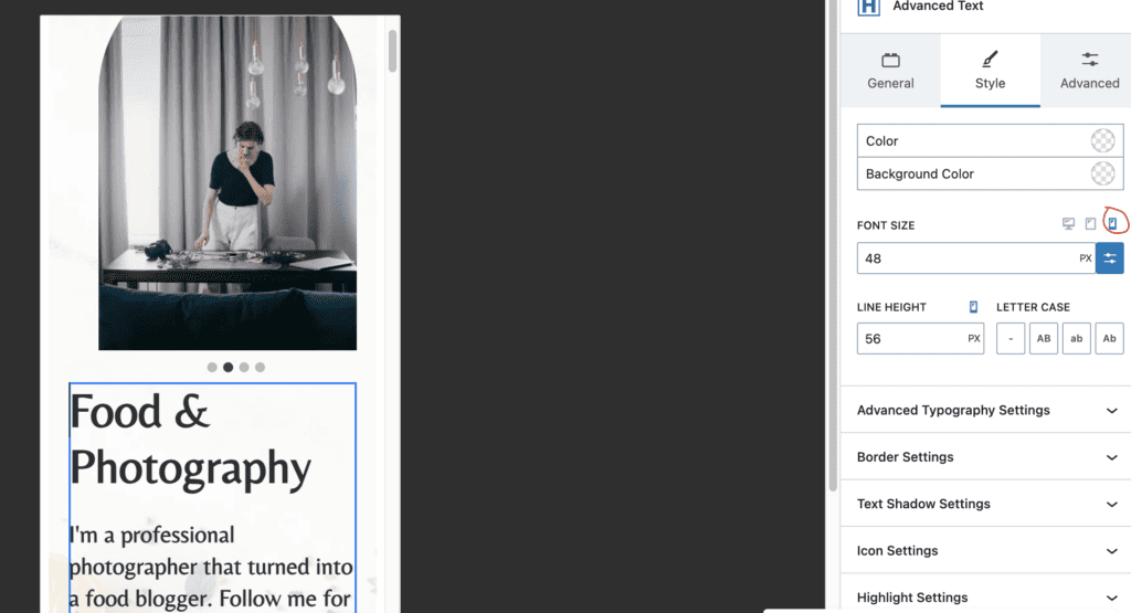
The `` Element
The `
Here’s a simple example:
<picture> <source media="(max-width: 767px)" srcset="mobile-image.jpg"> <source media="(min-width: 768px)" srcset="desktop-image.jpg"> <img src="fallback-image.jpg" alt="Responsive Image"></picture>
This code tells the browser: “If the screen is 767px or smaller, load the mobile image; otherwise, load the desktop image.” The `` tag at the end acts as a fallback for browsers that don’t support `
Advantages:
- Efficient, only loads the needed image
- Supports art direction, allowing different cropping or composition
- Great for high-DPI screens or different resolutions
Using CSS for Responsive Images
If you prefer a simpler approach, you can make images responsive with CSS. By setting the image width to 100% and height to auto, images will scale to fit their container, making them adaptable to various screen sizes.
<img src="your-image.jpg" alt="Responsive Image" class="responsive"><style> .responsive { max-width: 100%; height: auto; display: block; }</style>
This method is perfect for images that don’t need to change entirely based on device, but just need to resize gracefully.
Combining Techniques for Best Results
For the best user experience, you can combine the `
Remember, optimizing images isn’t just about choosing the right method—also consider compressing images for faster load times. Tools like TinyPNG or ImageOptim can help reduce file sizes without sacrificing quality.
By mastering these responsive image techniques, you’re well on your way to creating a website that looks stunning everywhere—on a smartphone in your hand or on a wide desktop monitor. It’s all about delivering a seamless experience, no matter how your visitors browse your site!
5. Implementing Plugins for Device-Specific Image Display
If you’re looking for a straightforward way to show different images on mobile and desktop without diving deep into code, plugins can be your best friends. They come with user-friendly interfaces and often require just a few clicks to get everything set up. Here are some popular options and how they can help:
Popular Plugins to Consider
- WP Mobile Detect: This plugin automatically detects the device type and lets you display specific content based on whether visitors are on mobile or desktop.
- Device Theme Switcher: It allows you to assign different themes or content blocks depending on the device, making it easy to manage images separately.
- Responsive Image Maps & Lightbox: These plugins help with more advanced image handling but can also be configured for device-specific images.
How to Use a Plugin for Device-Specific Images
- Install and Activate the Plugin: Go to your WordPress dashboard, navigate to Plugins > Add New, search for your chosen plugin, and click Install Now, then Activate.
- Configure Plugin Settings: Each plugin will have its own setup process, but generally, you’ll find options to specify images for mobile and desktop views.
- Assign Images: Upload or select your images within the plugin interface, specifying which ones should appear on mobile and which on desktop.
- Insert into Posts or Pages: Some plugins provide shortcodes or blocks to insert device-specific content directly into your posts or pages.
Benefits and Considerations
Using plugins makes it super easy and quick to implement device-specific images without touching code. However, keep in mind that some plugins may add extra load time or conflicts with other plugins. Always test thoroughly after installation to ensure everything displays correctly across devices.
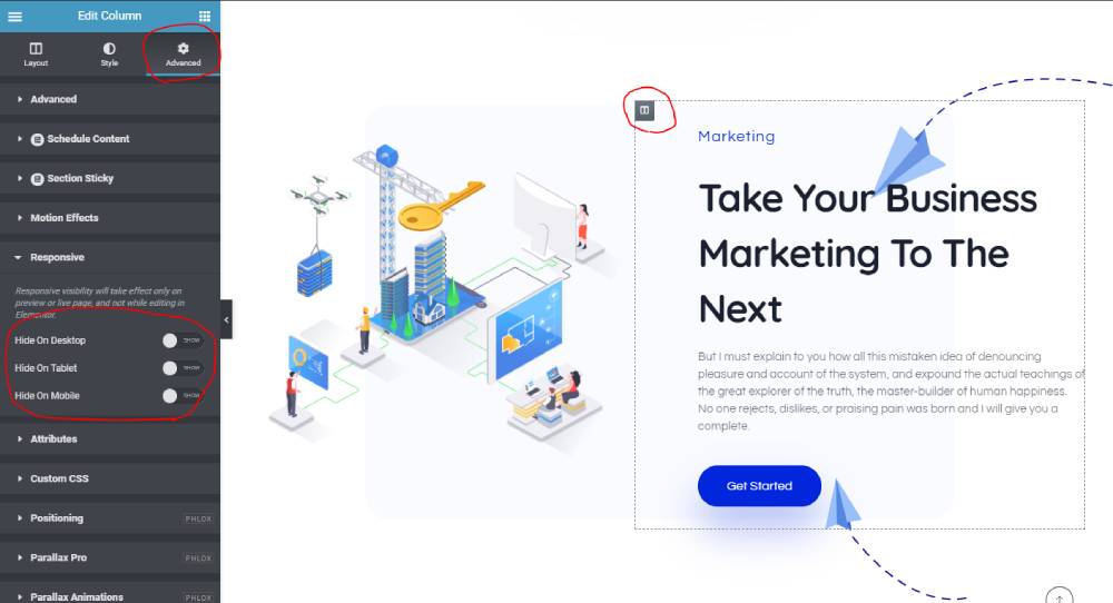
6. Customizing Your Theme to Show Different Images on Mobile and Desktop
If you’re comfortable with a bit of coding, customizing your theme can give you more control and flexibility over how images appear on different devices. Here’s a step-by-step guide to help you get started:
Step 1: Use CSS Media Queries
CSS media queries are the most common way to target specific device sizes. You can hide or show images based on screen width:
/ Hide desktop images on small screens /@media only screen and (max-width: 767px) { .desktop-image { display: none; }}/ Hide mobile images on larger screens /@media only screen and (min-width: 768px) { .mobile-image { display: none; }}
Step 2: Add Images with Specific Classes
Inside your post or page editor (preferably in the Text or HTML view), insert your images with distinct classes like so:
<img src="path-to-desktop-image.jpg" class="desktop-image" alt="Desktop Image" /><img src="path-to-mobile-image.jpg" class="mobile-image" alt="Mobile Image" />
Step 3: Customize Your CSS
Add the CSS code from Step 1 to your theme’s stylesheet or via the Customizer (Appearance > Customize > Additional CSS). This will ensure that only the appropriate image shows based on the device width.
Step 4: Test and Tweak
Always preview your site on different devices or resize your browser window to see the effects. Adjust the max-width and min-width values if needed to ensure images switch at optimal breakpoints.
Additional Tips
- Optimize images: Use appropriately sized images for each device to improve load times.
- Use WordPress functions: For more dynamic control, you can leverage PHP functions to detect device types and load images conditionally, but this requires editing your theme files.
- Child Themes: Always customize via a child theme to prevent your changes from being overwritten during theme updates.
By combining CSS techniques with your theme customization, you gain precise control over how images are displayed across devices. It might take a little time to fine-tune, but the result is a seamless, tailored experience for all visitors. Whether you choose plugins or custom code, both paths can help you make your WordPress site more user-friendly and visually appealing on every device!
7. Best Practices for Optimizing Images for Mobile and Desktop Devices
When it comes to displaying images differently on mobile and desktop, optimization is key. You want your images to look great without slowing down your site or draining your visitors’ data plans. Here are some best practices to keep in mind:
- Use responsive image formats: Modern formats like WebP provide high quality with smaller file sizes, making them perfect for both mobile and desktop. Consider converting your images to WebP for better performance.
- Resize images appropriately: Upload images that are large enough for desktop displays but not excessively big, which can slow down mobile loading times. Use image editing tools to create multiple versions tailored for different screen sizes.
- Implement lazy loading: Lazy loading delays the loading of images until they’re needed, improving page load times, especially on mobile devices with slower connections.
- Use descriptive alt text: Not only does this improve accessibility, but it also helps search engines understand your images, which can boost your SEO efforts.
- Test across devices: Regularly preview your site on various devices and screen sizes to ensure images display correctly and look appealing everywhere.
- Optimize image compression: Tools like TinyPNG or ImageOptim can reduce file sizes without sacrificing quality. Smaller images load faster and save bandwidth.
- Utilize a CDN (Content Delivery Network): CDNs distribute your images across multiple servers worldwide, ensuring faster delivery to users regardless of their location or device.
Finally, always keep an eye on your site’s performance using tools like Google PageSpeed Insights or GTmetrix. They offer valuable insights into how your images are impacting load times and what you can do to improve them. Remember, optimized images are the secret sauce to a fast, user-friendly website on all devices!
8. Conclusion and Final Tips for Managing Device-Specific Images in WordPress
Managing device-specific images in WordPress might seem a bit daunting at first, but with the right strategies, it becomes a straightforward process that significantly enhances your site’s user experience. The key is to think about your visitors—what they see, how fast they see it, and how to make their browsing seamless across all devices.
Here are some final tips to keep in mind:
- Plan your image assets: Decide early which images need to be different for mobile and desktop. Not every image requires a variation, so focus on high-impact visuals like banners, hero images, or product photos.
- Leverage plugins wisely: Use reliable plugins like WP Responsive Images or specific image display plugins that support device-specific settings. They can automate much of the process and save you time.
- Consistent testing: Regularly test your website on various devices, browsers, and screen sizes. This helps catch any display issues before your visitors do.
- Keep your images organized: Maintain a clear folder structure and naming conventions for different image versions. This simplifies updates and helps prevent confusion.
- Stay updated: WordPress and plugin updates often include performance improvements and new features for handling images. Keeping everything current ensures you benefit from the latest optimizations.
- Balance quality and performance: Always aim for a good balance between image quality and file size. Remember, faster load times lead to better engagement and lower bounce rates.
To wrap things up, managing device-specific images in WordPress is all about thoughtful planning, utilizing the right tools, and continuous testing. When done correctly, it results in a website that looks stunning and performs smoothly on every device—boosting user satisfaction and helping your site stand out. Happy optimizing!