Hey there! If you’re looking to spice up your WordPress site and make it more engaging, then a responsive image carousel might just be what you need. These nifty sliders display multiple images in a sleek, interactive way that works beautifully on both mobile phones and desktop computers. The best part? You don’t need to be a tech wizard to set one up! In this post, I’ll walk you through how to create a responsive image carousel that looks great everywhere, from tiny screens to big monitors. Ready to make your website more dynamic and eye-catching? Let’s dive in!
Why a Responsive Image Carousel Is Important for Your Website
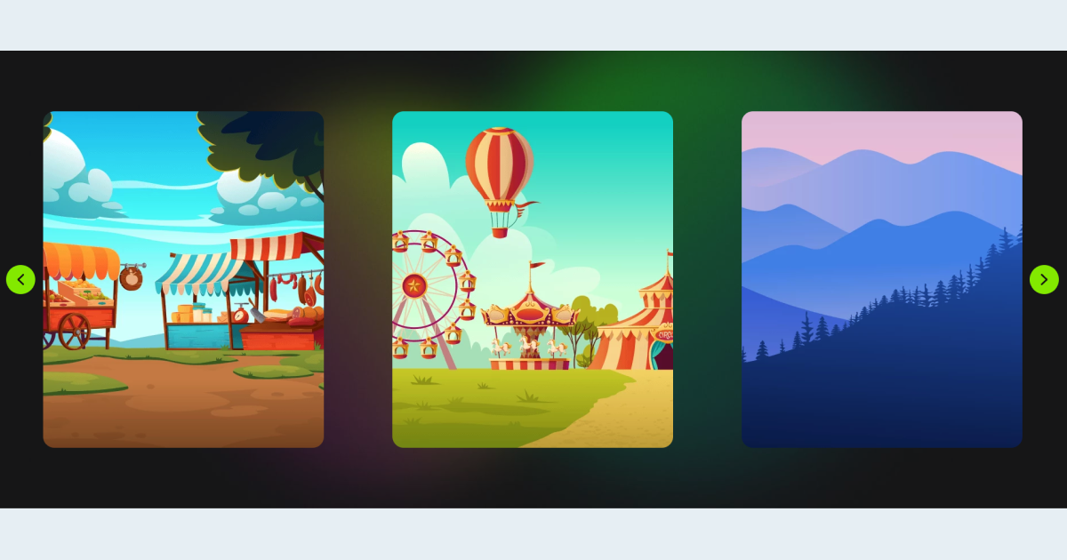
Imagine browsing the web on your phone and seeing a static gallery that doesn’t resize or look good on your device—that’s frustrating, right? That’s where responsiveness comes in. A responsive image carousel adapts seamlessly to different screen sizes, ensuring your visitors have a smooth and enjoyable experience no matter what device they’re using. Here’s why it’s a game-changer:
- Enhanced User Engagement: Interactive sliders keep visitors interested longer, encouraging them to explore more of your content.
- Better Visual Appeal: Show off your best images, products, or portfolio pieces in a way that looks professional and attractive.
- Improved Mobile Experience: With more people browsing on smartphones and tablets, a responsive carousel ensures your site is user-friendly on smaller screens.
- Increased Conversion Rates: Well-designed carousels can highlight calls-to-action or featured products, helping boost sales or sign-ups.
Plus, having a responsive design aligns with Google’s SEO best practices. Search engines favor sites that are mobile-friendly, which can help improve your ranking in search results. All in all, a responsive image carousel isn’t just a nice feature; it’s a smart move to make your website more professional, accessible, and effective at capturing your audience’s attention.
3. Step-by-Step Guide to Creating a Responsive Image Carousel in WordPress
Creating a responsive image carousel in WordPress might sound intimidating at first, but with the right approach, it’s actually quite straightforward. Let’s walk through the process together, so you can showcase your images beautifully across all devices.
Step 1: Prepare Your Images
Before diving into the technical part, gather the images you want to feature. Make sure they are optimized for web — this means compressed for faster loading without sacrificing quality. You want your carousel to load quickly on both mobile and desktop, so consider resizing images to appropriate dimensions.
Step 2: Choose a Plugin
There are many options out there, but for now, pick a reputable plugin that supports responsiveness and is user-friendly. We’ll discuss options in detail in the next section, but for now, install and activate your chosen plugin via the WordPress dashboard.
Step 3: Create a New Carousel
Once your plugin is activated, navigate to its settings or menu item. Usually, you’ll find an option like “Add New Carousel” or “Create Carousel.” Click on it. Then, upload your images or select them from your media library. Many plugins allow you to drag and drop, making the process super simple.
Step 4: Configure Carousel Settings
This is where you customize how your carousel looks and behaves. Key settings to look out for include:
- Responsive layout: Ensure the plugin supports responsiveness—most modern plugins do.
- Slide speed and transition effects: Decide how fast images slide and what effects (fade, slide, etc.) you prefer.
- Navigation controls: Enable arrows, dots, or swipe gestures for mobile friendliness.
- Number of images per view: Set how many images appear at once, adjusting for mobile screens (usually 1 or 2) versus desktops.
Step 5: Insert the Carousel into Your Site
After customizing, save your carousel. Most plugins provide a shortcode or a block that you can insert into any page or post. Simply copy and paste the shortcode into your content editor, or use a block if you’re utilizing the Gutenberg editor.
Step 6: Preview and Fine-Tune
Preview your page to see the carousel in action. Check how it looks on various devices—use your browser’s developer tools or actual devices if possible. Make adjustments to settings as needed, ensuring the carousel is smooth, responsive, and visually appealing.
And there you go! With these steps, you’ll have a sleek, responsive image carousel that looks great on both mobile and desktop. The key is to choose the right plugin and customize it to fit your website’s style and needs.
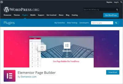
4. Choosing the Right Plugins for Your Image Carousel
Picking the perfect plugin can make all the difference in creating a seamless, responsive image carousel. There are lots of options out there, so how do you choose the best one? Let’s explore some important considerations and recommend a few popular plugins.
What to Look for in an Image Carousel Plugin:
- Responsiveness: The plugin should automatically adapt to different screen sizes without extra effort.
- Ease of Use: User-friendly interfaces and clear instructions save you time and frustration.
- Customization Options: Look for plugins that allow you to tweak transition effects, navigation controls, slide speed, and layout.
- Performance: Fast-loading and optimized code ensure your site remains quick and responsive.
- Compatibility: Make sure the plugin plays well with your current theme and other plugins.
- Support and Updates: Regular updates and accessible support can help you troubleshoot issues down the line.
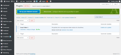
Popular WordPress Plugins for Responsive Image Carousels:
| Plugin Name | Highlights | Rating |
|---|---|---|
| MetaSlider |
|
4.5/5 |
| Smart Slider 3 |
|
4.8/5 |
| Swiper Slider |
|
4.7/5 |
| WP Slick Slider and Image Carousel |
|
4.2/5 |
Ultimately, the best plugin for you depends on your specific needs and comfort level. If you want a straightforward, easy-to-use option, MetaSlider or WP Slick might be perfect. For more advanced customization and animations, Smart Slider 3 or Swiper Slider could be better choices.
Remember to always check user reviews, update history, and support options before installing a plugin. A well-chosen plugin will not only make your site look great but also ensure a smooth experience for your visitors on any device.
5. Customizing Your Carousel for Mobile and Desktop Devices
One of the coolest parts about building a responsive image carousel is making sure it looks just right on all devices — whether someone’s checking out your site on a tiny phone or a big desktop monitor. It’s all about giving your visitors a seamless experience, no matter where they’re browsing from.
First off, consider how your carousel behaves differently on mobile versus desktop. On desktops, you might want larger images, multiple images visible at once, or even extra controls. On mobile, simplicity is key—think about fewer images visible at a time, bigger touch targets, and swipe gestures.
To customize effectively, you can use CSS media queries. For example:
@media (max-width: 768px) { / Styles for mobile devices / .your-carousel-class { / Make images full width for better mobile viewing / width: 100%; / Adjust height if needed / height: auto; } / Maybe hide some controls or change their size for easier tapping / .carousel-controls { font-size: 1.5em; }}@media (min-width: 769px) { / Styles for desktops and larger screens / .your-carousel-class { / Keep your desktop layout intact / width: 80%; }}
Another handy tip is to tweak the number of images shown at once. Many carousel plugins or custom setups let you set this dynamically. For example, on desktop, show three images side by side, but on mobile, just one. This makes your carousel flexible and user-friendly.
If you’re using a plugin like Slider Revolution, MetaSlider, or a similar tool, look into their built-in options for responsiveness. Many come with settings where you can specify different configurations for mobile and desktop. Just dive into those options, and you might find sliders where you can specify:
- Number of slides visible
- Navigation styles
- Image sizes
- Animation effects
Lastly, test your carousel on various devices and screen sizes. Use browser developer tools (like Chrome DevTools) or actual mobile devices if possible. Adjust your CSS and plugin settings based on your observations. The goal is to have a smooth, visually appealing experience everywhere!
6. Tips for Optimizing Image Loading and Performance
Let’s face it — no one likes waiting for a slow-loading website, especially when it comes to images. Large, unoptimized images can drag down your site’s speed, hurting user experience and even SEO rankings. So, optimizing your carousel images is a must!
Here are some practical tips to ensure your images load fast and look great:
1. Use the Right Image Formats
- JPEG for photographs and images with lots of colors.
- PNG for images requiring transparency or sharp edges.
- WebP — a modern format that offers high quality with smaller file sizes. Supported by most browsers now.
2. Compress Your Images
Before uploading, always compress your images. Tools like TinyPNG, ImageOptim, or Photoshop’s ‘Save for Web’ can significantly reduce file sizes without sacrificing too much quality. Smaller images mean faster load times.
3. Lazy Load Images
Implement lazy loading so that images only load when they’re about to enter the viewport. Many WordPress plugins, like Lazy Load by WP Rocket or a built-in feature in your theme, can make this easy. This way, users aren’t forced to download all images upfront, speeding up initial page load.
4. Serve Scaled Images
Ensure your images are scaled properly before uploading. Don’t upload a 2000×2000 px image and display it as 800×600 px — resize it first. This reduces unnecessary data transfer.
5. Use a Content Delivery Network (CDN)
Distribute your images via a CDN like Cloudflare or StackPath. CDNs deliver images from servers closest to your visitors, reducing latency and load times.
6. Enable Caching
Configure caching plugins or server settings to store images locally in visitors’ browsers. This way, repeat visitors don’t need to re-download images each time they visit your site.
7. Optimize Carousel Settings
Limit the number of images loaded at once and consider loading lower-resolution images on mobile devices, replacing them with higher-res versions if needed. Many plugins allow you to set different image sizes based on device type.
Remember, a snappy, well-optimized carousel not only keeps your site looking sleek but also encourages visitors to stay longer and engage more. Combining good design with performance best practices makes your WordPress site truly shine across all devices!
7. Testing Your Responsive Image Carousel Across Devices
Once you’ve set up your responsive image carousel, the next crucial step is to test how it performs across different devices and screen sizes. This ensures your visitors have a seamless experience whether they’re on a smartphone, tablet, or desktop.
Start by previewing your website on various devices. Most modern browsers have built-in device mode tools:
- Google Chrome: Use the Developer Tools (F12 or right-click and select ‘Inspect’) and click the device toggle icon (a small phone/tablet). You can choose different device presets or customize screen sizes.
- Firefox: Similar to Chrome, press F12 to open Developer Tools, then click the ‘Responsive Design Mode’ icon.
- Safari: Enable ‘Develop’ menu in Preferences > Advanced, then select ‘Enter Responsive Design Mode.’
Test your carousel by resizing the viewport or switching between device presets. Pay attention to:
- Image scaling: Are images resizing correctly without distortion?
- Navigation controls: Are buttons or indicators easy to tap on smaller screens?
- Loading speed: Do images load quickly without lag?
- Content visibility: Is all important information visible without excessive scrolling?
If you notice any issues, tweak your CSS or carousel settings accordingly. Sometimes, small adjustments like increasing touch target sizes or optimizing images can make a big difference.
Don’t forget to test on actual devices if possible! Emulators are helpful, but real-world testing can reveal subtle issues like touch responsiveness or font readability.
Tools like BrowserStack or Sauce Labs can help if you want to test on multiple browsers and devices simultaneously without owning all those devices personally.
By thoroughly testing your carousel, you ensure everyone enjoys a smooth, engaging experience—no matter what device they use.
8. Conclusion and Best Practices for Maintaining Your Carousel
Creating a responsive image carousel is a fantastic way to showcase your images, products, or portfolio in a dynamic and engaging way. But the work doesn’t stop once it’s live. Regular maintenance and following best practices will keep your carousel looking fresh and functioning perfectly over time.
Here are some key tips to keep in mind:
1. Keep Your Images Optimized
Use appropriately sized images that are compressed for web. Large, unoptimized images can slow down your site, especially on mobile devices. Tools like TinyPNG or ImageOptim can help reduce file sizes without sacrificing quality.
2. Regularly Update Content and Settings
If you add new images or want to highlight different content, update your carousel accordingly. Also, check that your carousel plugin or code remains compatible with your WordPress theme and other plugins after updates.
3. Monitor Performance and User Engagement
Pay attention to analytics to see how visitors interact with your carousel. Are they clicking on images or links? If not, consider tweaking the design or content to make it more appealing.
4. Accessibility is Key
Ensure your carousel is accessible to all users. Use descriptive alt text for images, ensure keyboard navigation works, and avoid auto-advancing slides that can be distracting or confusing.
5. Test After Updates
Anytime you update your website, revisit your carousel across devices to confirm everything still looks and functions as expected. Small changes can sometimes introduce unexpected issues.
Remember, a well-maintained carousel can be a powerful tool to draw attention and improve user experience. Keep it fresh, optimized, and accessible, and it will serve your website well for years to come!