Hey there! If you’re looking to boost your website’s performance, landing pages are your best friends. They help guide visitors toward a specific action—like signing up, purchasing, or subscribing—without distractions. And when it comes to building stunning, functional landing pages easily, Divi is a game-changer. Divi’s intuitive visual builder makes designing appealing pages a breeze, even if you’re not a coding pro. In this post, we’ll walk through how to craft high-converting landing pages using Divi on WordPress, so you can turn visitors into loyal customers or subscribers without breaking a sweat.
Understanding the Importance of High-Converting Landing Pages
Let’s be real—your website is often the first impression potential customers get of your brand. A well-designed landing page can be the difference between someone bouncing off your site or becoming a dedicated follower. High-converting landing pages are tailored to focus visitors’ attention on a single goal, whether it’s capturing leads, promoting a product, or encouraging a sign-up.
Why do they matter so much? Because they significantly impact your marketing ROI. Instead of a cluttered homepage or a generic page, a targeted landing page reduces distractions, increases engagement, and drives conversions. Think of it like a salesperson guiding a customer toward a specific purchase—clear, persuasive, and focused.
Some key benefits of high-converting landing pages include:
- Increased Conversion Rates: More visitors complete the desired action.
- Better User Experience: Clear messaging and easy navigation keep visitors engaged.
- Enhanced Campaign Performance: Whether you’re running ads or email marketing, dedicated landing pages improve results.
Creating these pages might seem intimidating, but with tools like Divi, you get an intuitive drag-and-drop builder that makes the process straightforward and fun. So, understanding why they matter is the first step toward mastering the art of conversion optimization. Ready to dive deeper? Let’s explore how to design these high-impact pages effectively using Divi on WordPress!
3. Getting Started with Divi Builder for Landing Page Design
So, you’re excited to create a stunning and effective landing page using Divi? Great choice! Divi Builder is a powerful drag-and-drop tool that makes designing your page both fun and straightforward, even if you’re not a coding wizard.
First things first, you’ll want to make sure you have Divi installed and activated on your WordPress site. Once that’s done, creating a new landing page is simple:
- Go to your WordPress dashboard.
- Click on Pages > Add New.
- Give your page a compelling title, like “Get Started Today” or “Join Our Community.”
- On the right sidebar, find the Page Attributes box and select Divi Builder.
- Click the Use Divi Builder button to launch the builder interface.
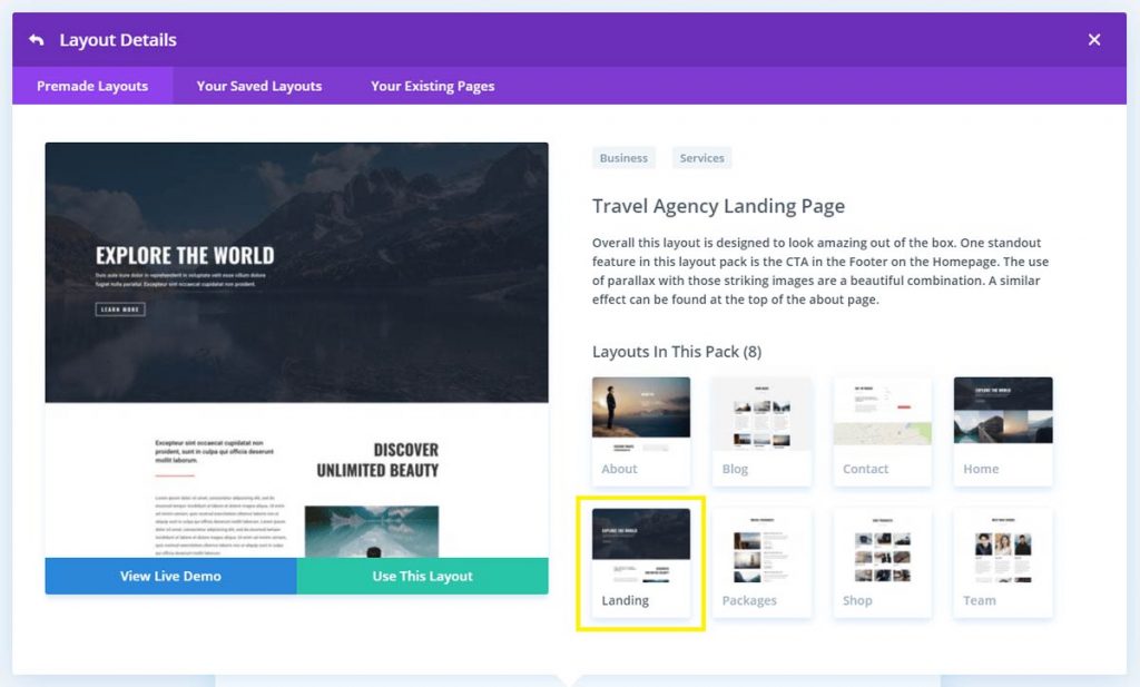
Once you’re inside the Divi Builder, you’ll see two main options: Build From Scratch or Choose a Premade Layout. For complete customization, starting from scratch is great, but if you’re short on time, premade layouts can give you a head start.
Here’s what you’ll typically do next:
- Add Sections: Think of sections as the big containers on your page — headers, testimonials, call-to-action, etc.
- Add Rows: Within each section, you add rows to organize your content. Divi offers various column structures, from single columns to multiple columns, so you can design your layout flexibly.
- Insert Modules: Modules are the building blocks—texts, images, buttons, forms, videos, and more. Just drag and drop them into your columns.
As you build, Divi provides live editing, so you see your changes instantly. Want to tweak the style or layout? Simply click on the module or section, and you’ll get options for customizing fonts, colors, spacing, and more. Play around until it feels just right!
Pro tip: Use the Preview button often to see how your landing page looks on different devices. Responsive design is key to high conversions!
Remember, the goal with Divi Builder is to make the process smooth and enjoyable. Don’t be afraid to experiment with different layouts and modules. The more you practice, the more confident you’ll become in creating beautiful, high-converting landing pages that grab attention and drive results.
4. Planning Your Landing Page Layout and Content Strategy
Before you dive into designing your landing page, it’s crucial to plan out your layout and content strategy. Think of your landing page as a sales pitch—every element should guide visitors toward taking a specific action, whether that’s signing up, purchasing, or downloading.
Start with these key steps:
Define Your Goal
What do you want visitors to do on this page? Be specific. Is it to sign up for a newsletter? Register for an event? Download a free resource? Your entire layout and content should revolve around this goal.
Know Your Audience
Understanding your target audience helps tailor your messaging. What are their pain points? What solutions do you offer? Speak directly to their needs and desires to increase engagement.
Create a Clear Value Proposition
This is the why behind your offer. In a few words, tell visitors what they’ll get and why it matters. Make this prominent, usually at the top of your page, so visitors immediately understand the benefit.
Outline Your Content Sections
Typically, a high-converting landing page includes:
| Section | Purpose |
|---|---|
| Headline & Subheadline | Grab attention and convey your value quickly |
| Hero Image or Video | Visually showcase your offer or product |
| Benefit Highlights | Explain what the user gains |
| Social Proof | Build trust with testimonials, reviews, or logos |
| Call-to-Action (CTA) | Encourage visitors to take the next step |
| Additional Details or FAQs | Address common questions and reduce friction |
Craft Compelling Copy
Use clear, concise language. Focus on benefits, not just features. Use action verbs and create a sense of urgency or exclusivity when appropriate.
Design for Clarity and Focus
A cluttered page distracts visitors. Keep your layout clean, with plenty of whitespace. Highlight your CTA and make it stand out with contrasting colors or buttons.
Test and Refine
Once your landing page is live, monitor its performance. Use tools like Google Analytics or heatmaps to see where visitors click and how they behave. Test different headlines, images, and CTAs to optimize conversions.
Remember, a successful landing page isn’t just about looking good—it’s about guiding visitors seamlessly toward your goal. Spend time planning your layout and content strategy, and you’ll set yourself up for higher conversions and better results.
5. Design Tips for Eye-Catching and User-Friendly Landing Pages
Creating a landing page that not only looks great but also guides visitors towards taking action is both an art and a science. When using Divi, you have a ton of design flexibility, but it’s important to keep some core principles in mind to ensure your page is both eye-catching and user-friendly.
First off, simplicity is key. Avoid cluttering your landing page with too many elements. Focus on a clear, concise message and a single call-to-action (CTA). Think of your landing page as a funnel — you want to guide visitors smoothly toward your goal without distraction.
Next, use high-quality visuals. Bold images or videos can capture attention instantly and convey your message more effectively than text alone. Divi makes it easy to insert stunning visuals, so choose images that resonate with your target audience and reinforce your offer.
Color schemes also matter. Pick colors that align with your branding but also create contrast to make your CTA stand out. For example, if your background is light, consider a bright, contrasting button color to draw the eye.
Typography is another crucial element. Use easy-to-read fonts and keep font sizes large enough for comfortable reading. Highlight key points or offers with bold or different colored text to make them pop.
For layout, consider using whitespace generously. This helps your content breathe and prevents the page from feeling overwhelming. Divi’s grid system allows you to create balanced, visually appealing sections that are easy to scan.
Lastly, always keep responsiveness in mind. Your landing page should look and work perfectly on desktops, tablets, and smartphones. Divi’s responsive editing tools make it simple to adjust layouts for different devices.
In summary, an eye-catching and user-friendly landing page combines simplicity, strong visuals, clear messaging, contrast, and responsiveness. When these elements come together seamlessly, visitors are more likely to stay engaged and convert.
6. Adding and Customizing Modules in Divi for Optimal Conversion
One of the biggest advantages of using Divi is its extensive library of modules. These building blocks let you craft a landing page tailored to your goals, whether that’s capturing leads, selling a product, or promoting an event. Let’s explore how to add and customize modules for maximum impact.
First, to add a module, open Divi Builder and select the section or row where you want to place it. Then, click the gray “+” button, and choose from a variety of modules such as Text, Image, Call-to-Action, Forms, Testimonials, and more.
For example, a Call-to-Action (CTA) module is perfect for guiding visitors toward your desired action. You can customize its text, button style, and link. Make sure your CTA is compelling and stands out visually.
Adding a Form module is essential if your goal is lead generation. Customize the form fields based on the information you need, such as name, email, or phone number. Divi lets you design forms that match your branding and integrate seamlessly with your email marketing tools.
Visual elements like Image modules or Video modules help make your landing page more engaging. Upload high-quality visuals and adjust their size or alignment to fit your layout perfectly.
To optimize conversions, pay attention to module settings:
- Design: Adjust colors, fonts, spacing, and borders to match your branding and improve readability.
- Content: Write clear, concise copy that speaks directly to your audience’s needs and desires.
- Advanced: Use custom CSS or animations to add subtle effects that draw attention without overwhelming.
Don’t forget to leverage Divi’s spacing options—padding and margins—to create a clean, balanced layout. Proper spacing guides the eye naturally toward your CTA and key messages.
Finally, always preview your modules on different devices to ensure they look great everywhere. Divi’s responsive controls make this straightforward, so you can tweak each module’s appearance for mobile, tablet, and desktop views.
By thoughtfully adding and customizing modules, you create a cohesive, engaging landing page that encourages visitors to take action. Remember, the goal is to keep your design aligned with your conversion objectives while providing a seamless, enjoyable experience for your visitors.
7. Implementing Call-to-Action Strategies to Boost Engagement
Alright, let’s talk about one of the most crucial parts of your landing page: the Call-to-Action, or CTA for short. This is what guides your visitors to take that next step — whether it’s signing up for a newsletter, downloading a free resource, or making a purchase. A well-crafted CTA can dramatically boost your conversions, so it’s worth putting some thought into how you design and position it.
First things first, your CTA needs to be clear and compelling. Use action-oriented language that tells visitors exactly what you want them to do. Words like “Download Now,” “Get Started,” “Claim Your Spot,” or “Join the Community” work well because they create a sense of urgency and purpose. Keep it concise — nobody wants to read a paragraph of instructions.
Next, think about placement. Your CTA should be prominently visible without overwhelming the rest of your content. Many successful landing pages include a primary CTA above the fold—meaning visitors see it without scrolling. You can also consider placing secondary CTAs further down the page for visitors who need more information before deciding.
Visuals matter too. Make your CTA buttons stand out with contrasting colors that align with your branding but catch the eye. Use plenty of whitespace around the button so it doesn’t get lost in the clutter. And don’t forget to make the button size large enough to tap easily on mobile devices!
Another great strategy is to create a sense of urgency or scarcity. Phrases like “Limited Time Offer,” “Only a Few Spots Left,” or “Offer Ends Tonight” can motivate visitors to act quickly rather than delay their decision.
| Tip | Example |
|---|---|
| Use action verbs | “Download,” “Register,” “Get” |
| Create urgency | “Limited Time,” “Only Today” |
| Make it stand out | Bold colors, larger size, clear contrast |
| Position strategically | Above the fold and at the end of sections |
Finally, test different CTAs to see what resonates best with your audience. A/B testing different phrases, colors, or placements can reveal what drives the most engagement. Remember, the goal is to make it as easy and enticing as possible for visitors to take that next step.
8. Optimizing Your Landing Page for Mobile Devices
In today’s world, a huge chunk of web traffic comes from smartphones and tablets. If your landing page isn’t mobile-friendly, you’re essentially turning away a significant portion of potential conversions. Luckily, with Divi, creating a responsive, mobile-optimized landing page is straightforward — but it still requires some attention to detail.
First, ensure your design is truly responsive. Divi’s built-in responsive editing tools let you customize how your content looks on different devices. For example, you can adjust font sizes, spacing, and layout specifically for mobile screens without affecting the desktop view. Take advantage of these tools to make sure everything looks clean and easy to read on small screens.
Next, consider load times. Mobile users tend to abandon pages that load slowly. Optimize your images by compressing them without losing quality. Divi offers lazy loading options and allows you to specify different images for mobile if needed. Minimize the use of heavy scripts and unnecessary plugins that can slow down your site.
Navigation is another key aspect. Keep menus simple — often a hamburger menu (the three-line icon) works best. Make sure buttons and links are large enough to tap easily, with enough spacing to prevent accidental clicks. Remember, a cluttered or cramped layout can frustrate mobile visitors and decrease engagement.
Test your landing page on multiple devices and screen sizes regularly. Use tools like Google’s Mobile-Friendly Test to identify issues you might not notice on your own. Also, gather feedback from real users to understand how your page performs on different devices and make adjustments accordingly.
Lastly, don’t forget about the importance of readability. Use legible font sizes (at least 16px for body text), high-contrast colors for text and backgrounds, and avoid long blocks of text. Break content into easily digestible chunks with headings and bullet points, making it easier for mobile visitors to scan and comprehend quickly.
By investing time in mobile optimization, you’re not only enhancing user experience but also boosting your chances of conversions. Remember, a seamless mobile experience tells your visitors that you care about their needs, encouraging them to take action and engage with your brand.
9. Testing and Analyzing Landing Page Performance
Once you’ve built your landing page with Divi, the journey doesn’t end there. To truly maximize your conversions, it’s essential to continually test and analyze how your page is performing. Think of it as tuning a musical instrument—you make adjustments, listen carefully, and refine until everything sounds just right.
Start with setting clear goals. Are you aiming for email sign-ups, product sales, or perhaps webinar registrations? Knowing your primary objective helps you measure success more effectively. Then, use tools like Google Analytics or heatmap services such as Hotjar or Crazy Egg to gather data on user behavior.
A/B Testing is a powerful method here. It involves creating two or more versions of your landing page with slight variations—maybe changing the headline, call-to-action (CTA) button color, or layout—and then seeing which version performs better. Divi makes this process easier with split testing features, or you can use plugins designed for A/B testing.
| Element | Tested Variations | Purpose |
|---|---|---|
| Headline | Different wording or value propositions | Find out which headline resonates more and leads to higher engagement |
| CTA Button | Color, text, placement | Determine the most compelling CTA to prompt clicks |
| Images | Different images or videos | See which visuals better capture attention and drive conversions |
| Form Length | Short vs. long forms | Balance between collecting enough info and keeping users engaged |
After running your tests for a set period—say, a week or two—review the data. Look at metrics like bounce rate, time on page, click-through rate, and conversion rate. If one variation outperforms others, consider making it your default. Remember, ongoing testing is key because audience preferences and behaviors evolve over time.
Also, don’t forget to collect qualitative feedback. Ask users for their impressions through surveys or direct feedback forms. Sometimes, what the numbers show and what users say can reveal insights that data alone might miss.
10. Best Practices for Increasing Conversion Rates on Your Landing Pages
Getting visitors to convert is as much about strategy as it is about design. Here are some tried-and-true best practices that can help boost your landing page conversions when using Divi:
- Keep your message clear and concise: Make sure your headline and supporting copy immediately communicate the value. Visitors should understand what you offer and why it benefits them within seconds.
- Focus on a single, compelling CTA: Don’t overwhelm your visitors with multiple options. Highlight one primary action you want them to take, whether it’s signing up, buying, or downloading.
- Use persuasive visuals: High-quality images or videos that reinforce your message can significantly increase engagement. Divi’s visual builder makes it easy to add and customize media.
- Reduce friction: Minimize the number of form fields, eliminate unnecessary steps, and ensure your page loads quickly. Remember, every extra click or delay can lead to lost conversions.
- Build trust: Incorporate elements like testimonials, reviews, security badges, or guarantees. These reassure visitors that they’re making a safe and smart decision.
- Leverage social proof: Show how others have benefited from your offer. Including client logos, success stories, or user counts can boost credibility.
- Optimize for mobile: With more users browsing on smartphones, ensure your Divi landing pages are fully responsive and look great on all devices.
- Use urgency and scarcity: Limited-time offers, countdown timers, or limited availability can motivate visitors to act quickly.
- A/B test regularly: As mentioned earlier, continually experimenting with different elements helps you discover what works best for your audience.
Remember, the goal is to create a seamless, engaging experience that guides visitors toward taking the desired action. With Divi’s flexible design options and these best practices, you’re well on your way to crafting high-converting landing pages that drive real results.
Conclusion and Next Steps for Creating High-Converting Divi Landing Pages
Creating high-converting landing pages with Divi requires a combination of strategic design, compelling content, and user-focused elements. By leveraging Divi’s powerful drag-and-drop builder, customizable modules, and pre-designed templates, you can craft pages that not only look great but also drive conversions. Remember, the key is to keep your messaging clear, focus on a single call-to-action, and optimize your layout for user engagement.
Here are the next steps to ensure your landing pages succeed:
- Test and Optimize: Use A/B testing to compare different layouts, headlines, and calls-to-action to find what resonates best with your audience.
- Analyze Performance: Utilize analytics tools to monitor visitor behavior, conversion rates, and bounce rates, then adjust your pages accordingly.
- Enhance User Experience: Ensure fast load times, mobile responsiveness, and intuitive navigation to keep visitors engaged.
- Incorporate Trust Elements: Add testimonials, trust badges, and clear privacy policies to build credibility and reduce hesitation.
- Iterate and Improve: Continuously update your landing pages based on data insights and industry best practices to maintain high performance.
By following these steps and harnessing Divi’s versatile features, you’ll be well on your way to creating high-converting landing pages that effectively capture leads and grow your business.