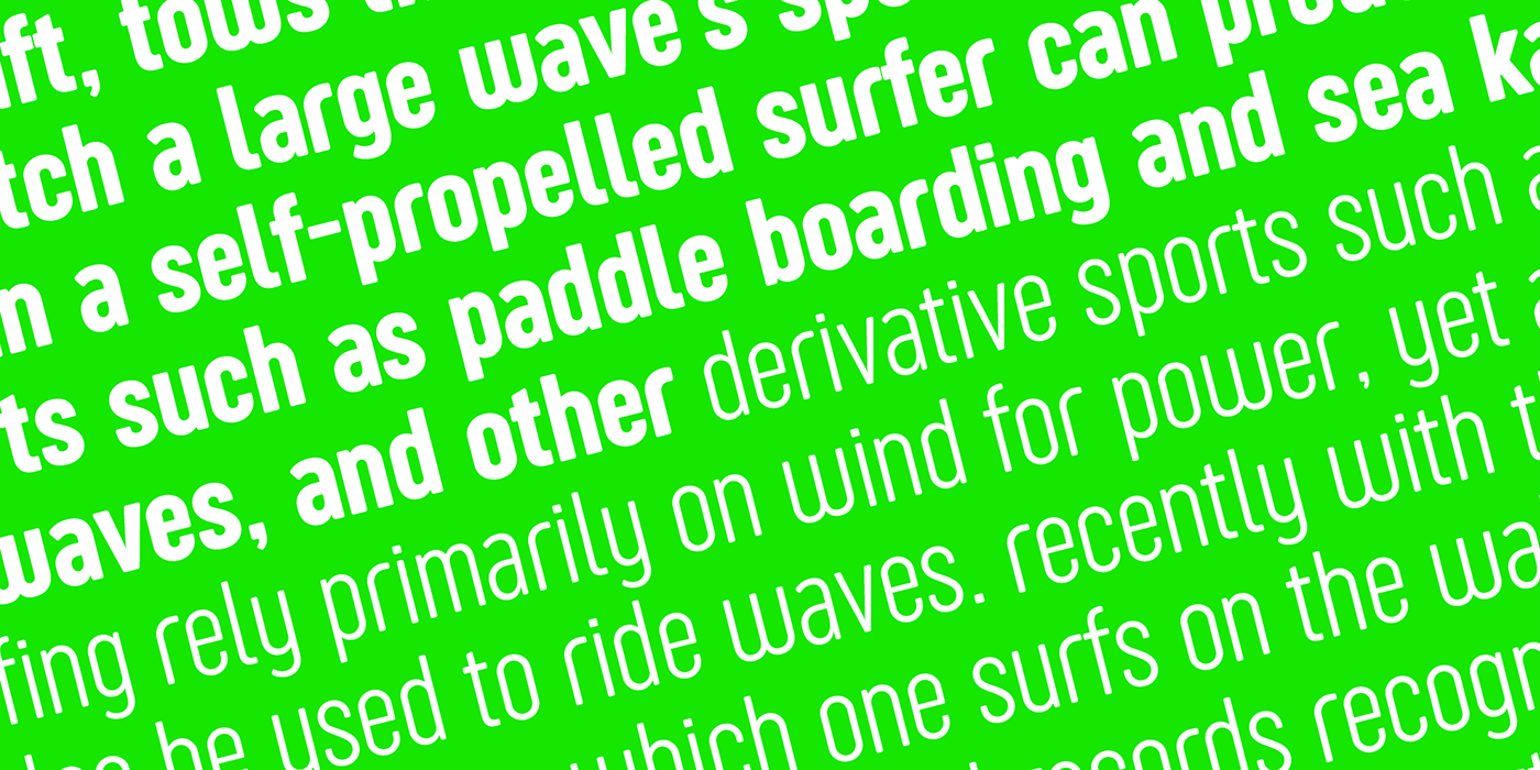
If you’ve been exploring fonts for your website, chances are you’ve come across the Sugo Display Font. It’s known for its bold, modern look that instantly grabs attention. Designed to make headlines pop and add a sleek touch to any project, Sugo Display is a popular choice among designers looking for a contemporary vibe. But like any font, it’s not a one-size-fits-all solution. Its distinctive style works great for certain brands and messages, but sometimes you might want to explore alternatives to match your unique website personality or improve readability across different devices. Understanding its role helps you decide when to stick with it or choose a different font that better suits your site’s needs.
Importance of Choosing the Right Font for Your WordPress Site
Picking the perfect font for your WordPress website isn’t just about aesthetics—it directly impacts how visitors perceive your brand and how easily they can consume your content. A well-chosen font enhances readability, conveys your site’s personality, and even influences conversion rates. For example, a playful font might work well for a kids’ toy store, while a clean, professional font suits a corporate site. When it comes to fonts like Sugo Display, which are bold and eye-catching, it’s essential to consider whether they fit your overall design and message. Using the wrong font can make your site look inconsistent or difficult to read, driving visitors away. That’s why exploring alternatives ensures you find the perfect match—fonts that align with your brand identity, improve user experience, and give your website that polished, professional look you desire.
3. Top Sugo Display Font Alternatives for WordPress
If you’re a fan of the sleek, modern vibe that Sugo Display Font brings to your website but are open to exploring other options, you’re in luck! There are plenty of fantastic fonts out there that can give your site a fresh look while maintaining that clean, stylish aesthetic. Here are some of the top Sugo Display alternatives you might want to consider for your WordPress site:
1. Montserrat
Montserrat is a popular Google Font that offers a modern, geometric style similar to Sugo Display. Its versatility makes it perfect for headings, menus, and even body text if you want a consistent look across your site. Plus, it loads quickly and is highly customizable, so you can tweak weights and sizes easily.
2. Poppins
Looking for something with a bit more rounded appeal? Poppins has a clean, contemporary aesthetic with geometric influences. It’s great for creating a friendly yet professional vibe, making it a great choice for startups, portfolios, or business websites.
3. Raleway
Raleway is an elegant, sans-serif font that works beautifully for headings and titles. It offers a slightly more refined look, perfect if you want your website to feel polished without sacrificing modernity. Raleway also comes in multiple weights, giving you flexibility in design.
4. Lato
If you’re after a font that combines readability with style, Lato might be the way to go. It has a warm, approachable tone, making your website feel friendly and inviting. Lato pairs well with many other fonts, so you can mix and match for a unique design.
5. Open Sans
For a highly functional and versatile option, Open Sans is a safe bet. It’s optimized for readability on screens and works well for both headings and body text. Its neutral appearance allows your content to shine without distraction.
6. Oswald
Want something a little more bold and impactful? Oswald has a condensed, strong presence that can make your headlines pop. It pairs nicely with lighter fonts for a balanced look.
All these fonts are available through Google Fonts, which makes embedding them into your WordPress site quick and easy. Simply choose your favorite, add the code to your site, and enjoy a fresh, modern look that’s just as stylish as Sugo Display but offers a bit of variety to keep your website unique!
4. Factors to Consider When Selecting a Font Replacement
Swapping out a font like Sugo Display for an alternative isn’t something to do on a whim. The font you choose will shape your website’s personality and impact how visitors perceive your brand. To make sure you pick the right fit, here are some key factors to keep in mind:
1. Readability and Legibility
First and foremost, your font needs to be easy to read. Think about the size, spacing, and weight — especially for longer texts or smaller screens. A font that looks great in headings might not work well for body copy, so test how it appears across devices.
2. Style and Mood
The font should reflect your brand’s personality. Do you want a modern, minimalist vibe? Or something more friendly and approachable? The style of the font — whether geometric, rounded, or classic — should align with your website’s tone and message.
3. Compatibility and Load Speed
Ensure the font is compatible with WordPress and loads quickly. Google Fonts are a popular choice because they’re optimized for web use. Slow-loading fonts can hurt user experience and SEO, so always test the performance impact.
4. Versatility
Look for fonts with multiple weights and styles. This flexibility allows you to create hierarchy and contrast within your content, making your design more dynamic and engaging.
5. Pairing with Other Fonts
If you plan to use different fonts for headings and body text, choose fonts that complement each other. A good rule of thumb is to select fonts with contrasting styles — for example, pairing a bold display font with a simple sans-serif for body text.
6. Licensing and Usage Rights
Most Google Fonts are free to use commercially, but always double-check licensing if you’re considering premium fonts. Make sure your chosen font aligns with your budget and legal requirements.
Ultimately, investing a bit of time in selecting the right font can significantly enhance your website’s look and feel. Think about your brand, your audience, and the overall user experience — and pick a font that helps your website stand out in all the right ways!
5. How to Implement Font Alternatives on Your WordPress Website
So, you’ve found the perfect Sugo Display font alternative but wondering how to actually get it onto your WordPress site? Don’t worry—it’s easier than you might think! Here’s a simple step-by-step guide to help you seamlessly implement your new font choice.
Step 1: Choose the Right Font Service
Many font alternatives are available via popular services like Google Fonts or Adobe Fonts. These platforms offer easy-to-use embedding options and integrate smoothly with WordPress. For example, Google Fonts is free and has a vast library of beautiful fonts.
Step 2: Get the Embed Code
- Navigate to your chosen font’s page (e.g., Google Fonts).
- Select your preferred font styles and weights.
- Copy the provided embed code (usually a
<link>tag in the HTML).
Step 3: Add the Font to Your WordPress Site
There are a few ways to do this:
- Using a Child Theme’s functions.php: Add the embed code or enqueue the font via PHP.
- Using a Plugin: Plugins like Easy Google Fonts or Custom Fonts make it super simple. Just install, activate, and select your font in the plugin settings.
- Using the Customizer: Some themes allow you to add custom CSS or code snippets directly in the Customizer’s Additional CSS section.
Step 4: Apply the Font to Your Elements
Once the font is loaded, you need to specify where it appears. You can do this with custom CSS, like:
h1, h2, h3 { font-family: 'Your Chosen Font', sans-serif;}Replace ‘Your Chosen Font’ with the font’s name, ensuring it matches exactly what the service provides.
Step 5: Test and Tweak
Finally, preview your website on different devices and browsers to ensure the font looks great everywhere. Adjust sizes, line-heights, or letter-spacing as needed to achieve the perfect typography.
And that’s it! With a little bit of tinkering, your website will showcase a fresh, stylish font that enhances your branding and readability.
6. Conclusion and Final Tips for Enhancing Your Site’s Typography
Choosing the right font is more than just picking something pretty—it impacts your site’s readability, mood, and overall user experience. If you’re considering alternatives to Sugo Display, remember that the best choice aligns with your brand’s personality and website goals.
Here are some final tips to help you elevate your site’s typography:
- Stick to a limited font palette: Using 2-3 complementary fonts is usually enough. Too many can make your site look cluttered and confusing.
- Prioritize readability: Especially for body text, choose fonts that are easy to read on all devices.
- Use contrast wisely: Ensure there’s enough contrast between your text and background to enhance legibility.
- Maintain consistency: Use the same font styles for headings, subheadings, and body text across your site to create a cohesive look.
- Experiment with size and spacing: Play around with font sizes, line-height, and letter-spacing to improve the overall aesthetic and user experience.
Remember, typography is a powerful tool that shapes how visitors perceive your website. Don’t be afraid to try different fonts and see what resonates best with your audience. Keep it simple, consistent, and aligned with your brand identity, and your site will not only look great but also be more engaging and user-friendly.
Happy designing! With these tips and the right font choices, your website will stand out with style and clarity.